Role
Research, IA, build
Team
Team of three
Timeline
Aug to Dec 2024
Tools
Figma, Miro, Lovable
At a glance
A three-person student project at Arizona State University, Aug to Dec 2024. I led research and information architecture, and designed and built the product with two teammates.
Problem
Cost is decided last
Budget is the first thing a traveller decides and the last thing any planner shows them.
Approach
Budget becomes the first input
Budget is the first field, every row has a price, and one meter turns red when you go over.
Outcome
Built, not yet tested
10 sections designed and built. 7 of 8 navigation groups straight from the card sort. 3 changes shipped from feedback.
01 · Problem
So the budget, the one constraint that decides whether the trip happens, is the only thing no tool holds. It lives in the traveller’s head and gets reconciled at the end, when changing anything is expensive.

76%
combine maps, booking sites, reviews and video for one trip
43%
spend days or longer planning a single multi-stop trip
48%
spend hours on it
39%
take 3 to 5 trips a year; 48% take 1 or 2
Travellers optimise for
The decision
The hours before booking, when they are still choosing what to give up.
Tools optimise for
The booking
The moment money moves. That is where cost finally appears.
Both AI planners we reviewed generate an itinerary and then tell you what it costs. That leaves the traveller with a plan they like and can’t afford, and no visible way to trade down.
How might we
02 · Research
We surveyed 23 travellers, interviewed 5, and tore down Wanderlog, Trip Planner AI, Wonderplan, Stippl, Roadtrippers and Rome2Rio. The other findings confirmed what we already believed.
23
survey responses, 82% aged 18 to 34
5
moderated interviews, 14-question guide
6
competitors torn down, 17 features each
6
card-sort participants, 31 cards
Interview participant, 2024. Reconstructed from session notes, not a transcript. This line is why Collaboration has an expense engine: the part of group travel people dread is collecting the money after the bill is split.
What this research can’t support
23 respondents, 82% aged 18 to 34 and 52% earning under $25,000, are unusually budget-constrained, which makes budget-first look better than it is. Our competitive matrix also scored TripWise ahead on all 17 features, a sign the rubric was written around the product. The gaps used on this page are ones you can check on a competitor’s live site.
03 · People
Jack plans alone and wants to see where the money goes. Lisa plans for a group and wants control of the shared budget.
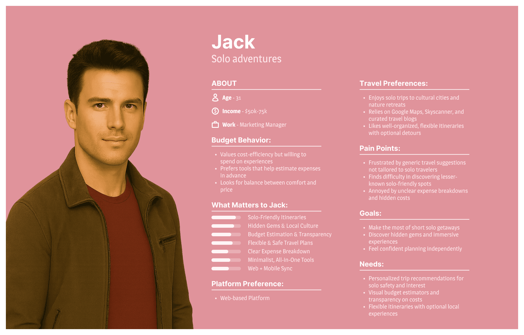
Jack, solo adventures
31 · Marketing Manager · web-based. Wants budget estimation and transparency; hates unclear expense breakdowns and hidden costs.
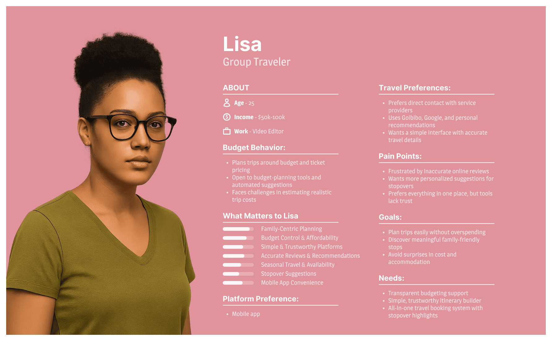
Lisa, group traveller
25 · Video Editor · mobile app. Wants budget control and trustworthy platforms; wants personalised stopover suggestions.
04 · Insights
Four findings changed the product. Each one maps to a screen.
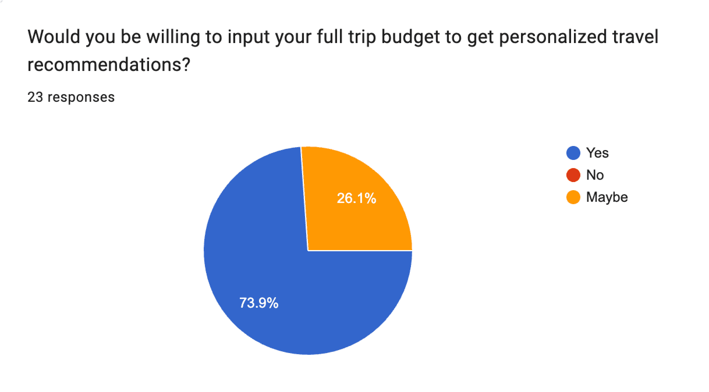
74%
What we found
would enter their full trip budget for personalised recommendations. 26% said maybe, nobody said no.
What changed
Budget became a required field on the landing form.
65%
What we found
already set a budget before planning, and 26% more want to but have no consistent way to hold it.
What changed
The product catches a habit people already have.
70%
What we found
enjoy stopovers and want suggestions for places between destinations. Rome2Rio treats the space between cities as a transport connection; Wanderlog offers basic suggestions.
What changed
Stopovers became part of the structure of a trip.
87%
What we found
want flights, stays and activities in one place.
What changed
It confirmed the scope, and that each part had to hold up against the specialist tool.
05 · Structure
We wrote 31 tasks on sticky notes and asked six participants to group them. Budget Bar and Recommended Plan landing together under Plan & Budget told us the budget belonged on the main screen, not in settings.
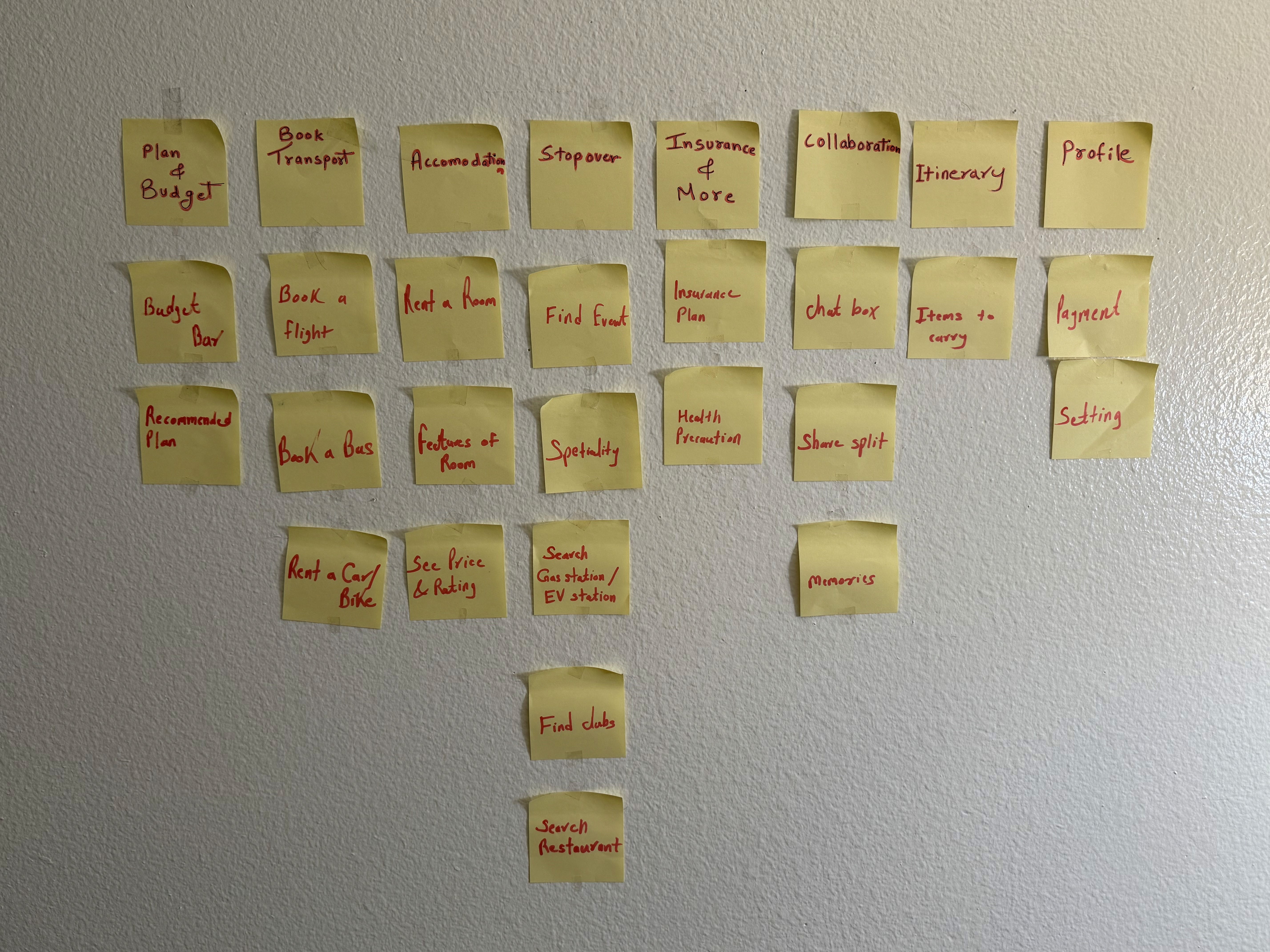
Open card sort: 6 participants, 31 cards. The column heads are the participants’ own words.
Two groups did not survive the interface
Itinerary lost its own section
Participants separated the plan they’re offered from the plan they’ve committed to. As two rail items that meant navigating away to compare, so it became two tabs in one place, Recommended Plans and My Itinerary. My Itinerary stays empty until you apply a plan.
Packing got its own section
It went the other way and was promoted out, because it is the one section people open after the trip has started.
19 greyscale wireframes, structure before style
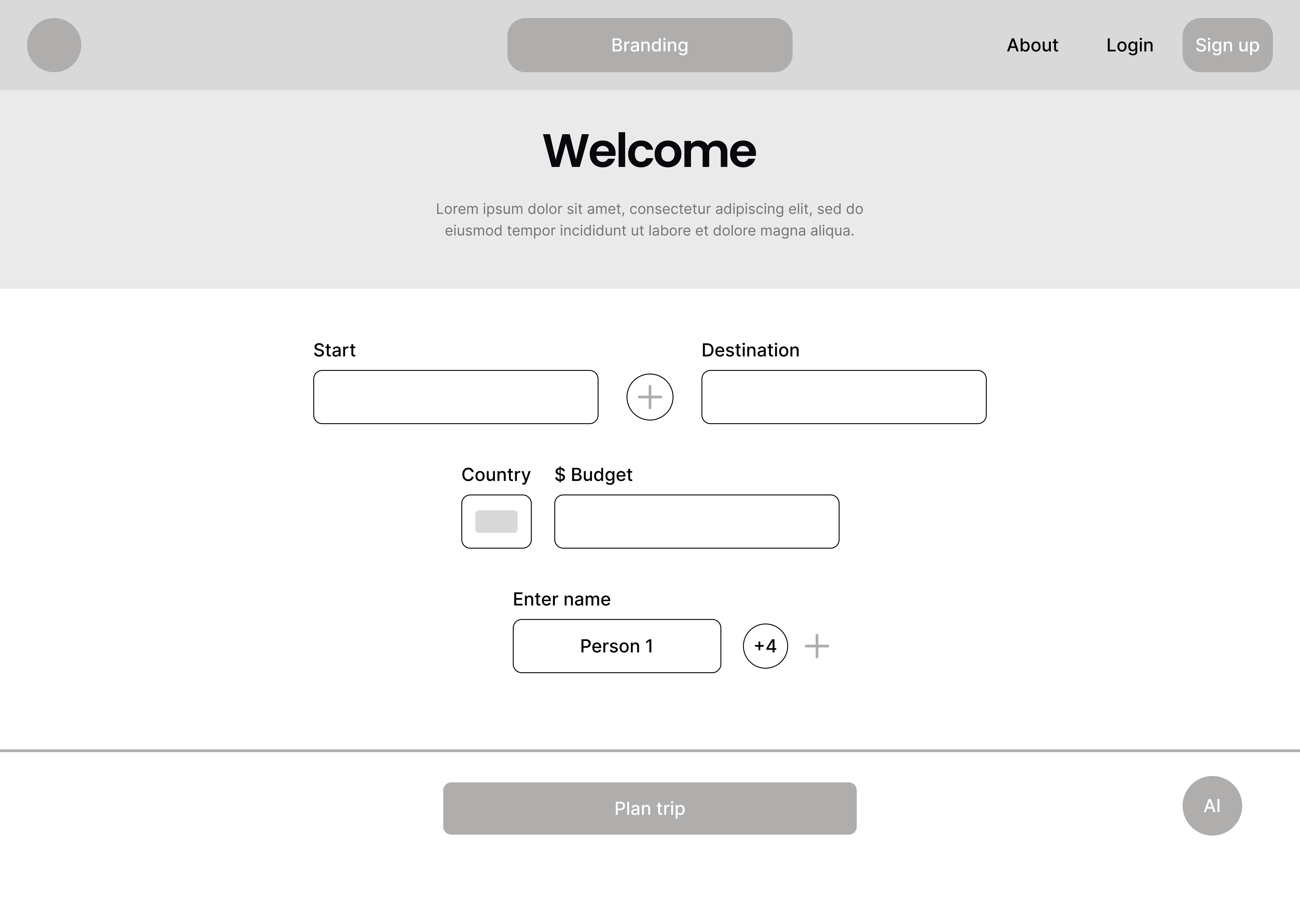
Landing page
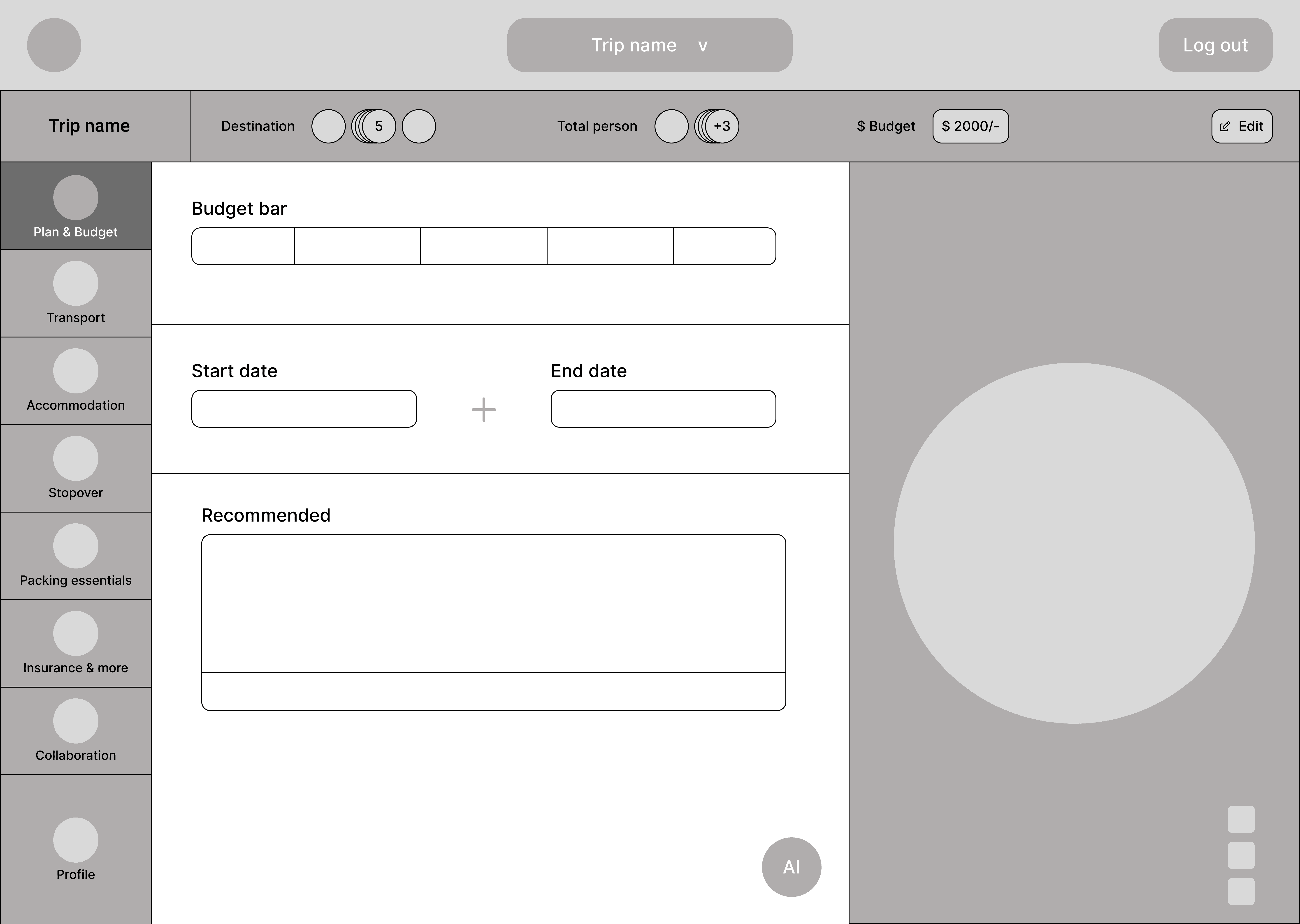
Plan & budget
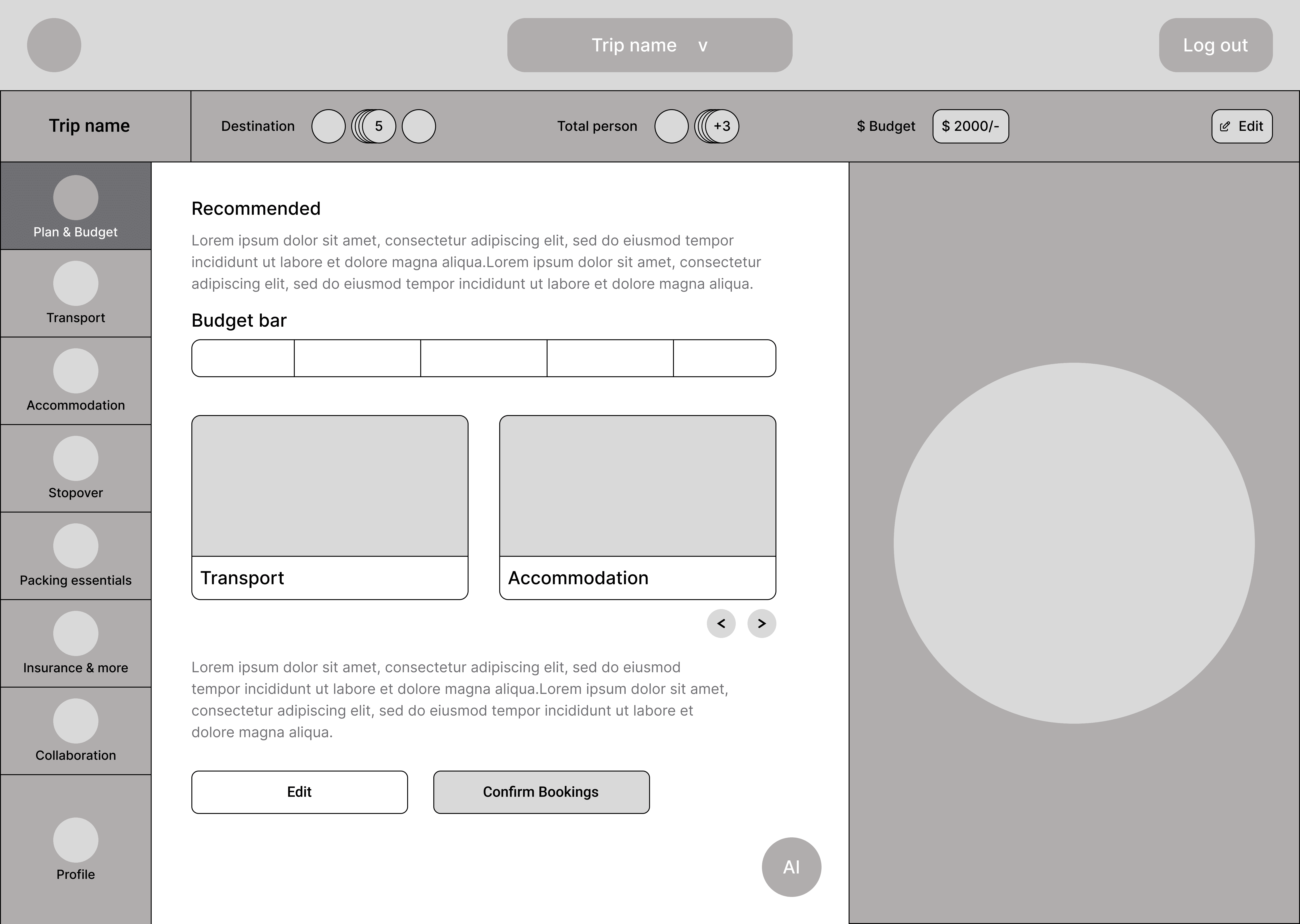
Plan & budget 2
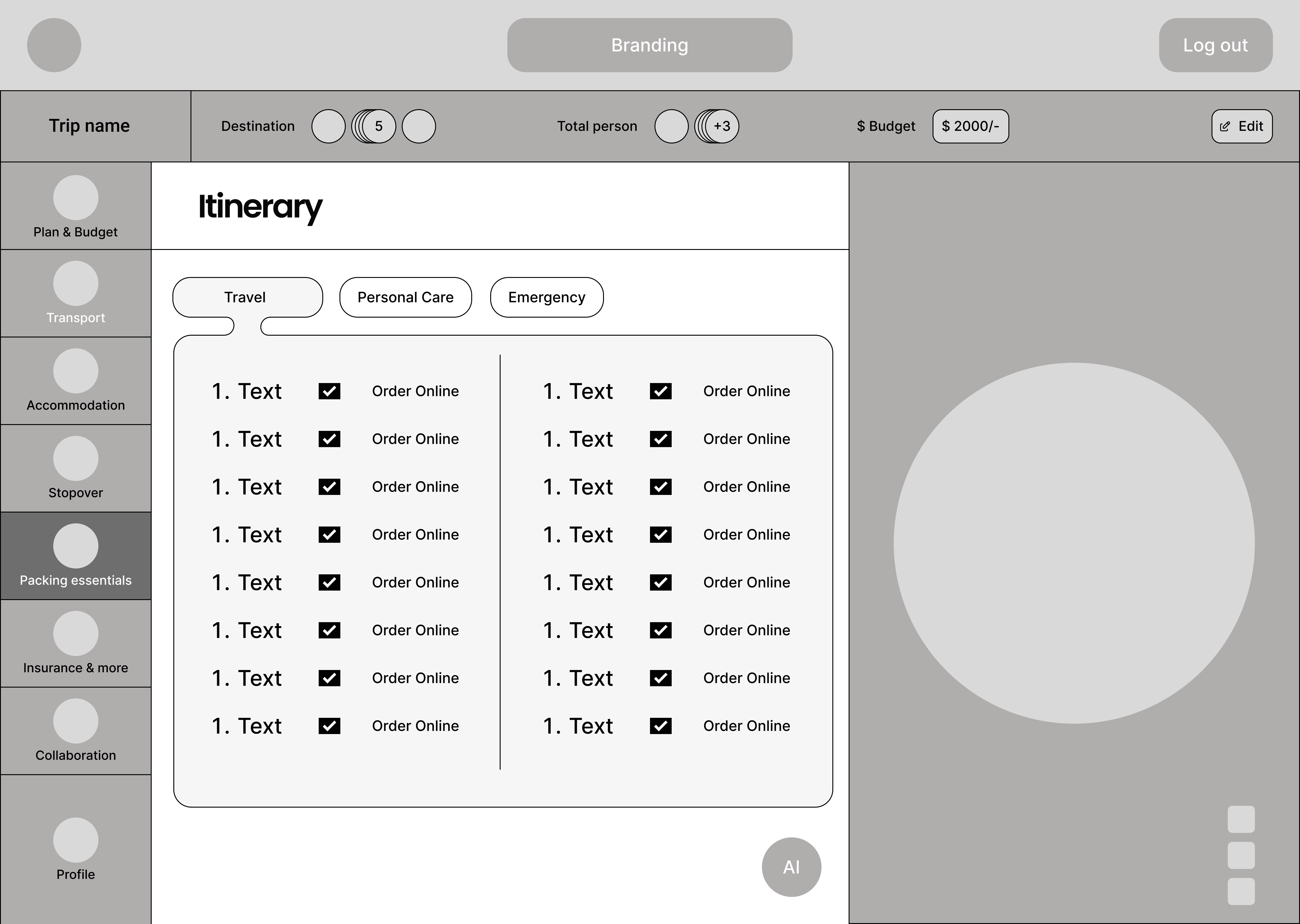
Itinerary
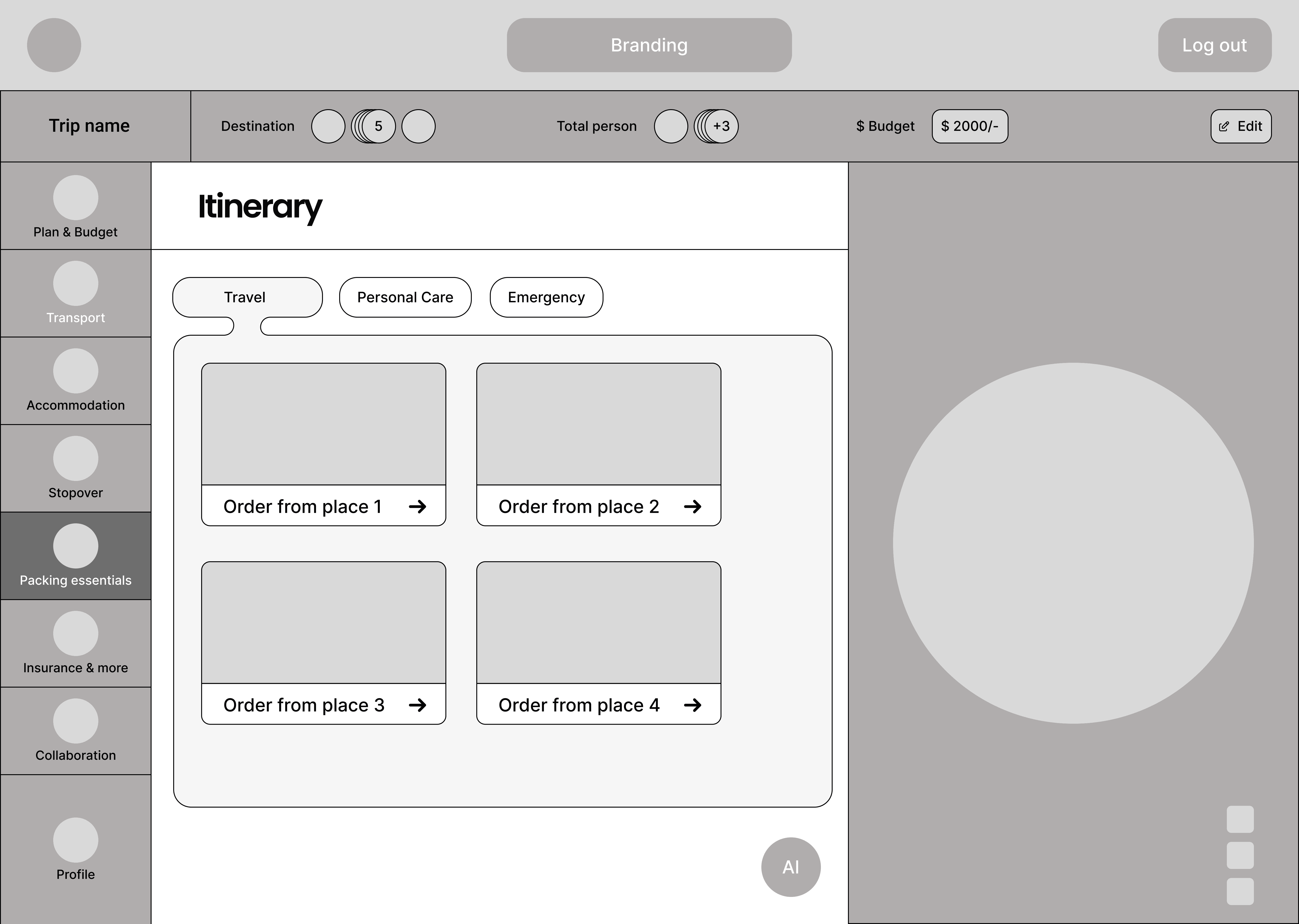
Itinerary 2
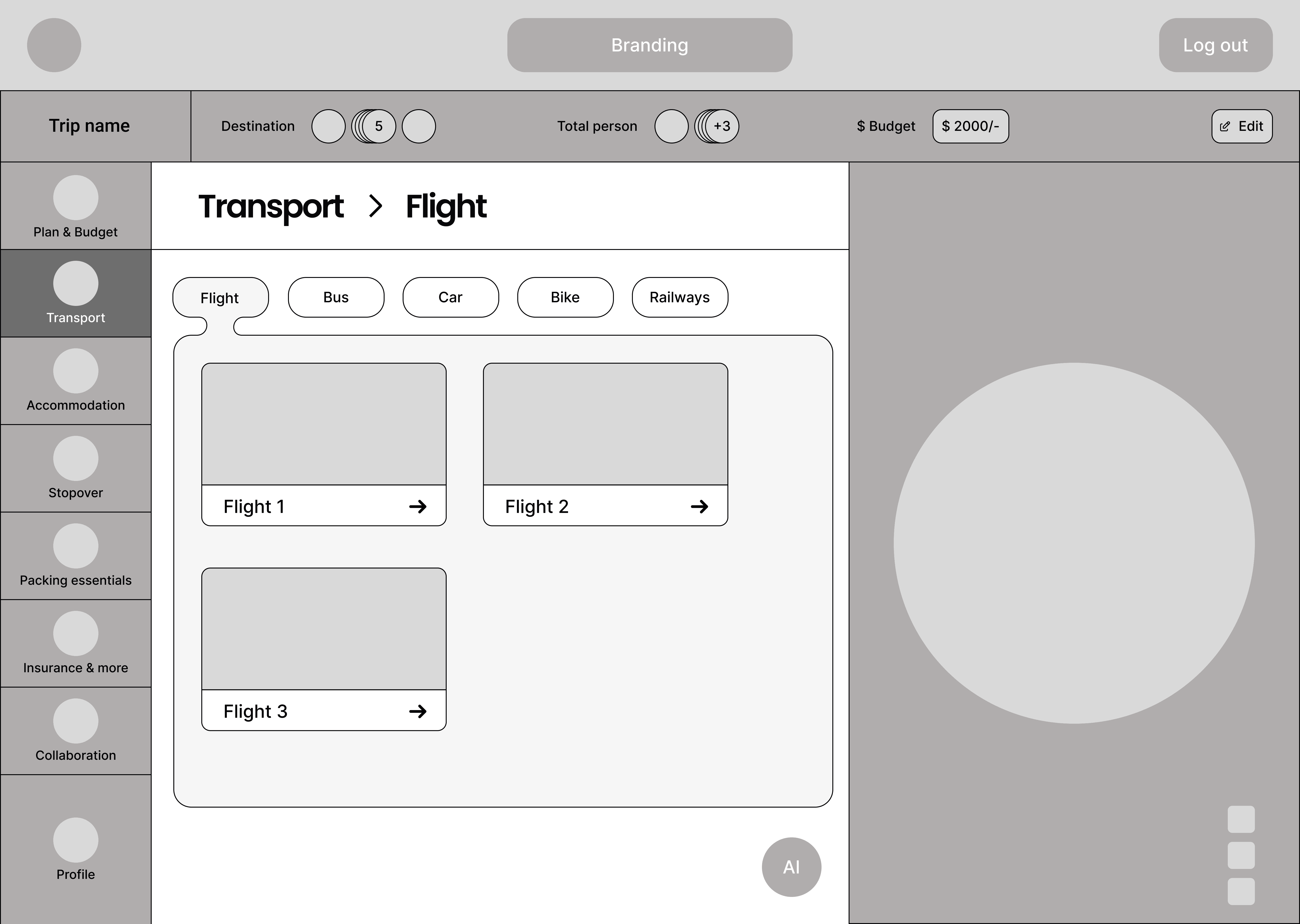
Flight
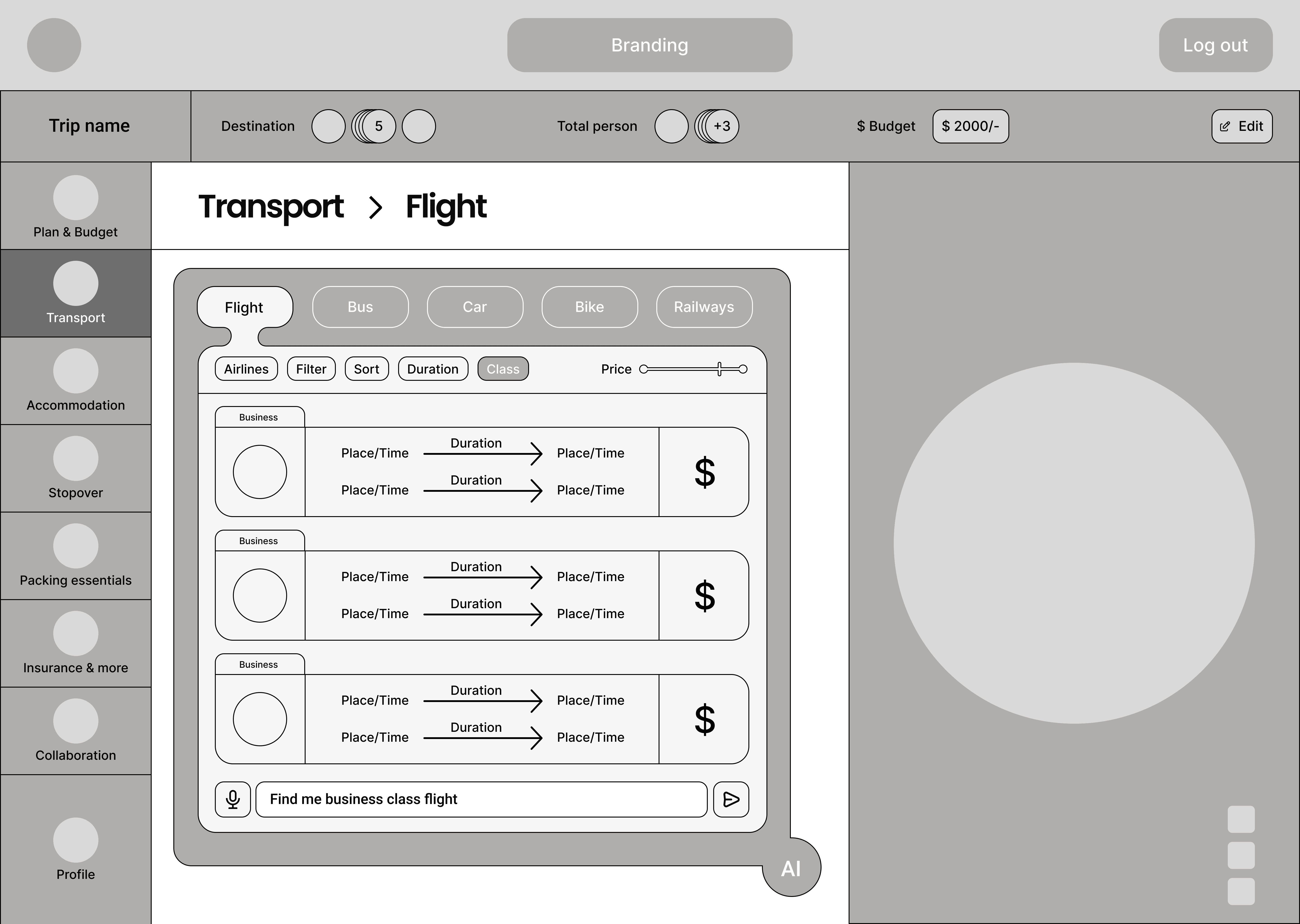
Flight, AI
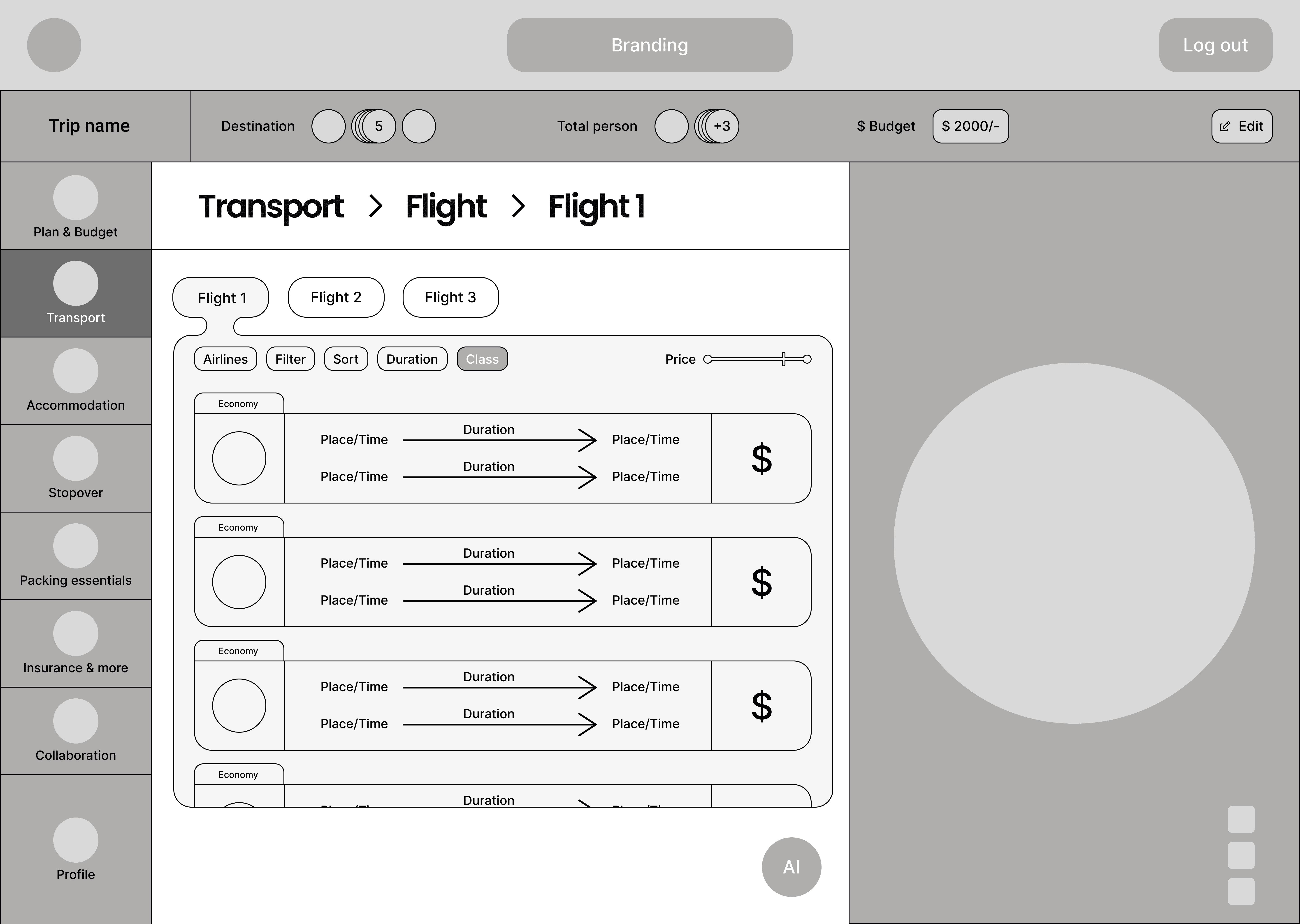
Flight, alternatives
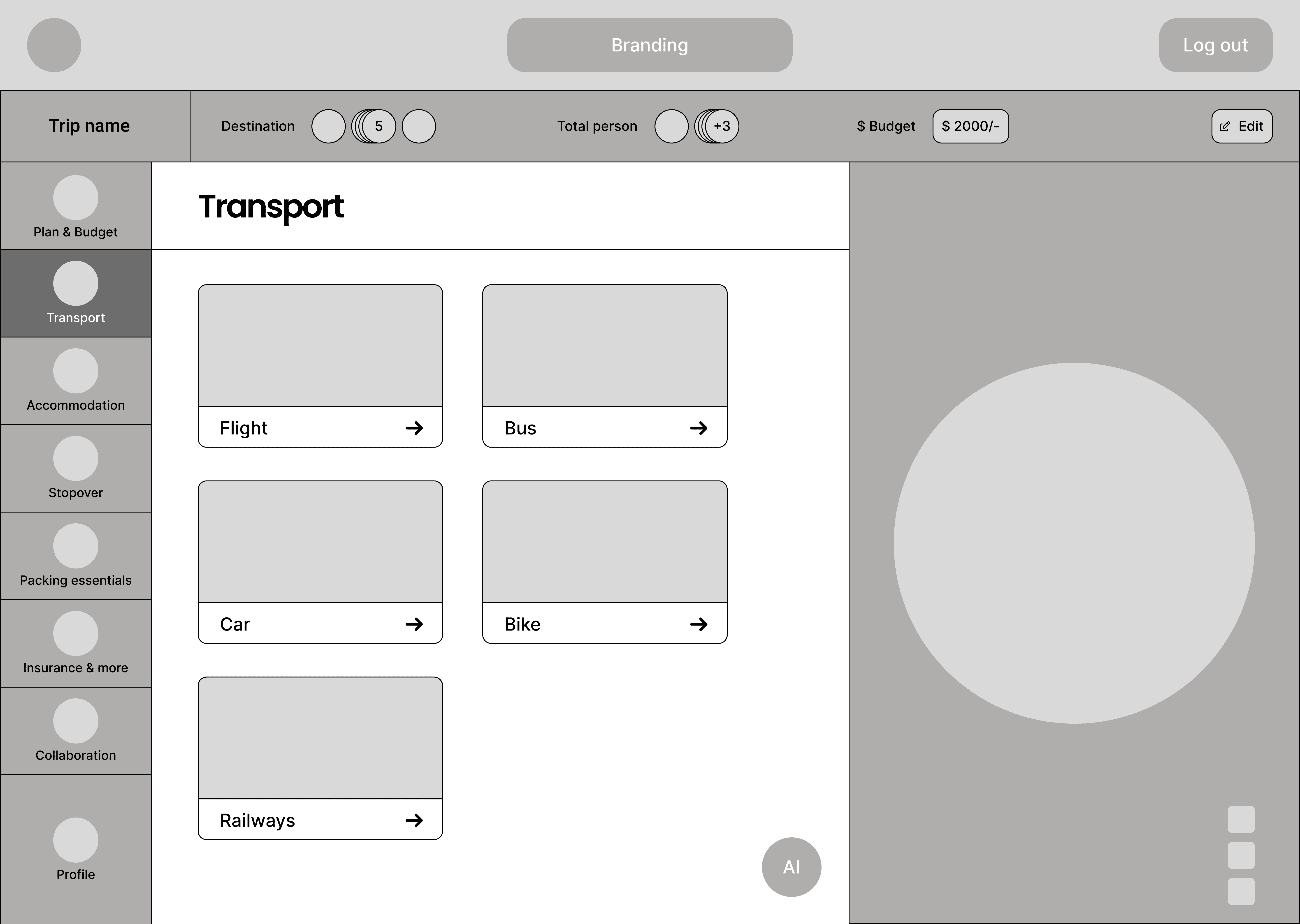
Transport
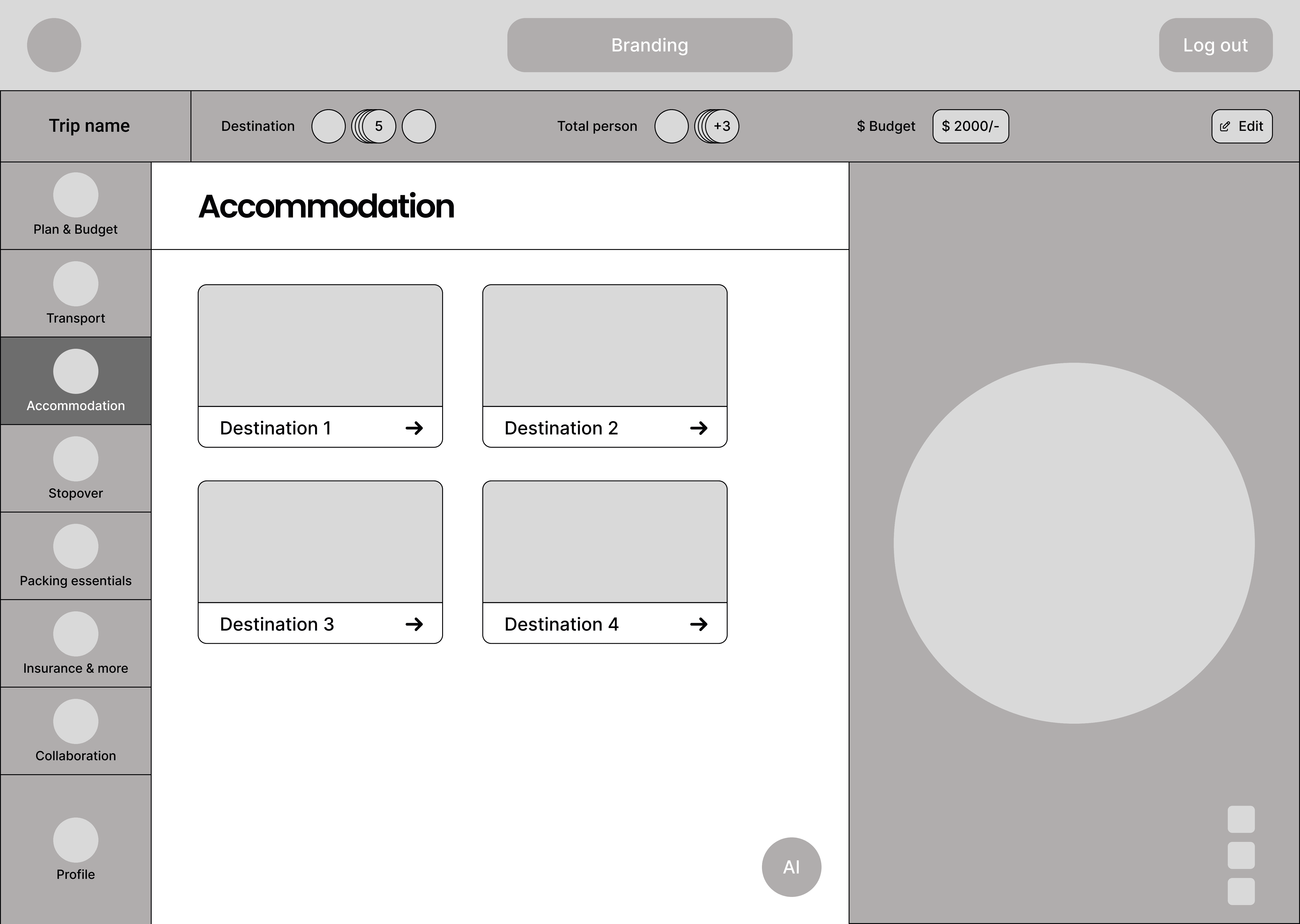
Accommodation
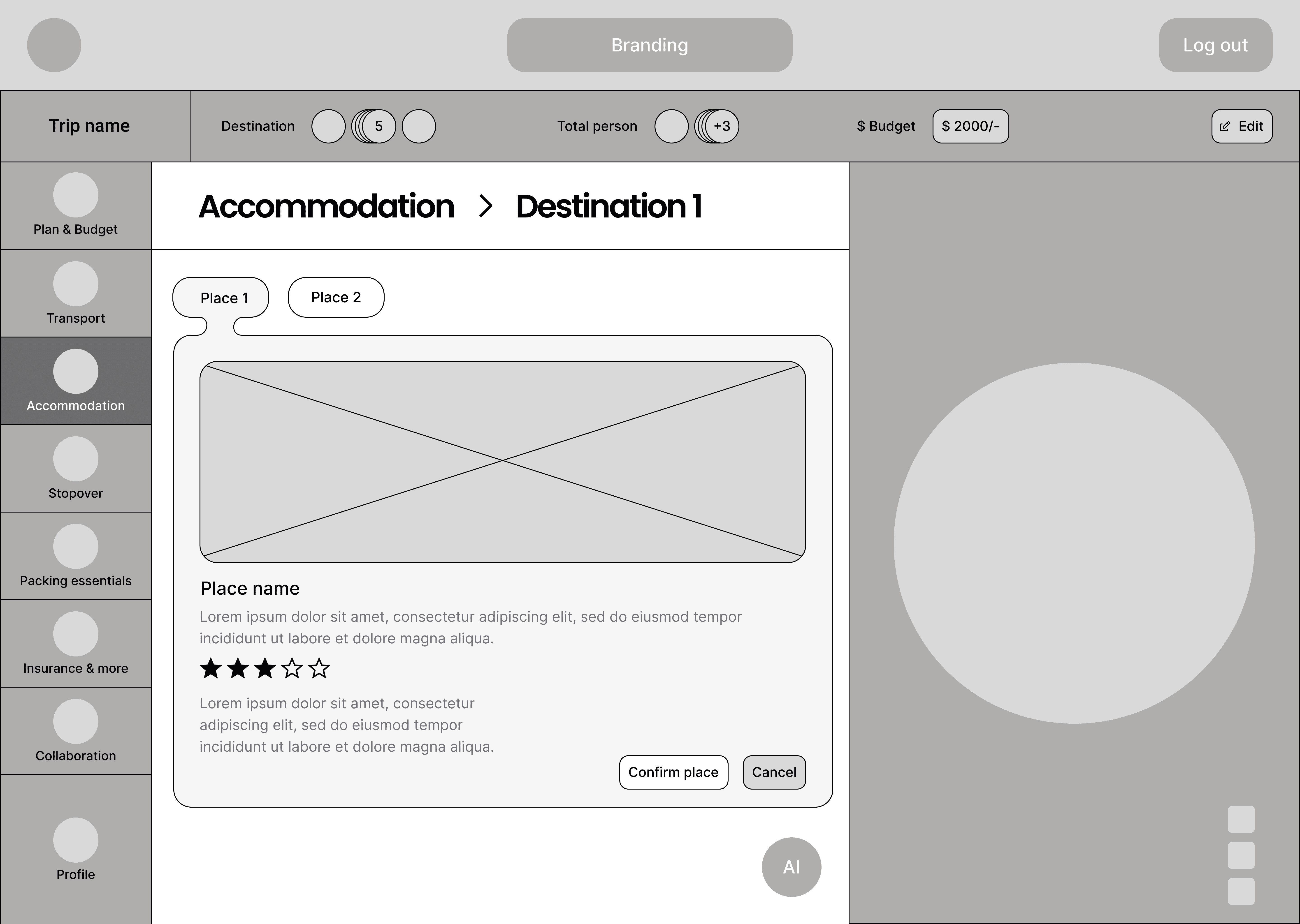
Accommodation 2
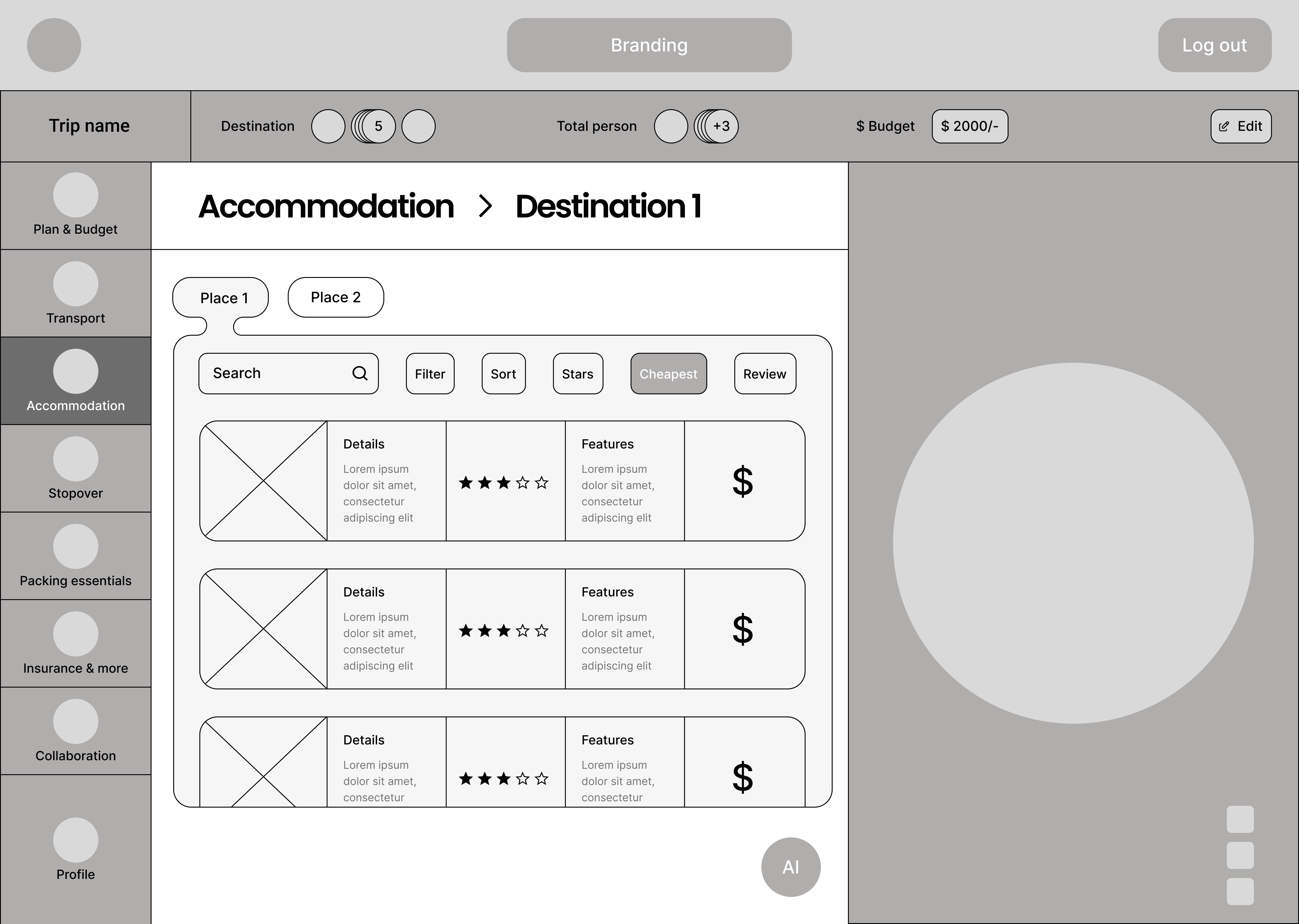
Accommodation 3
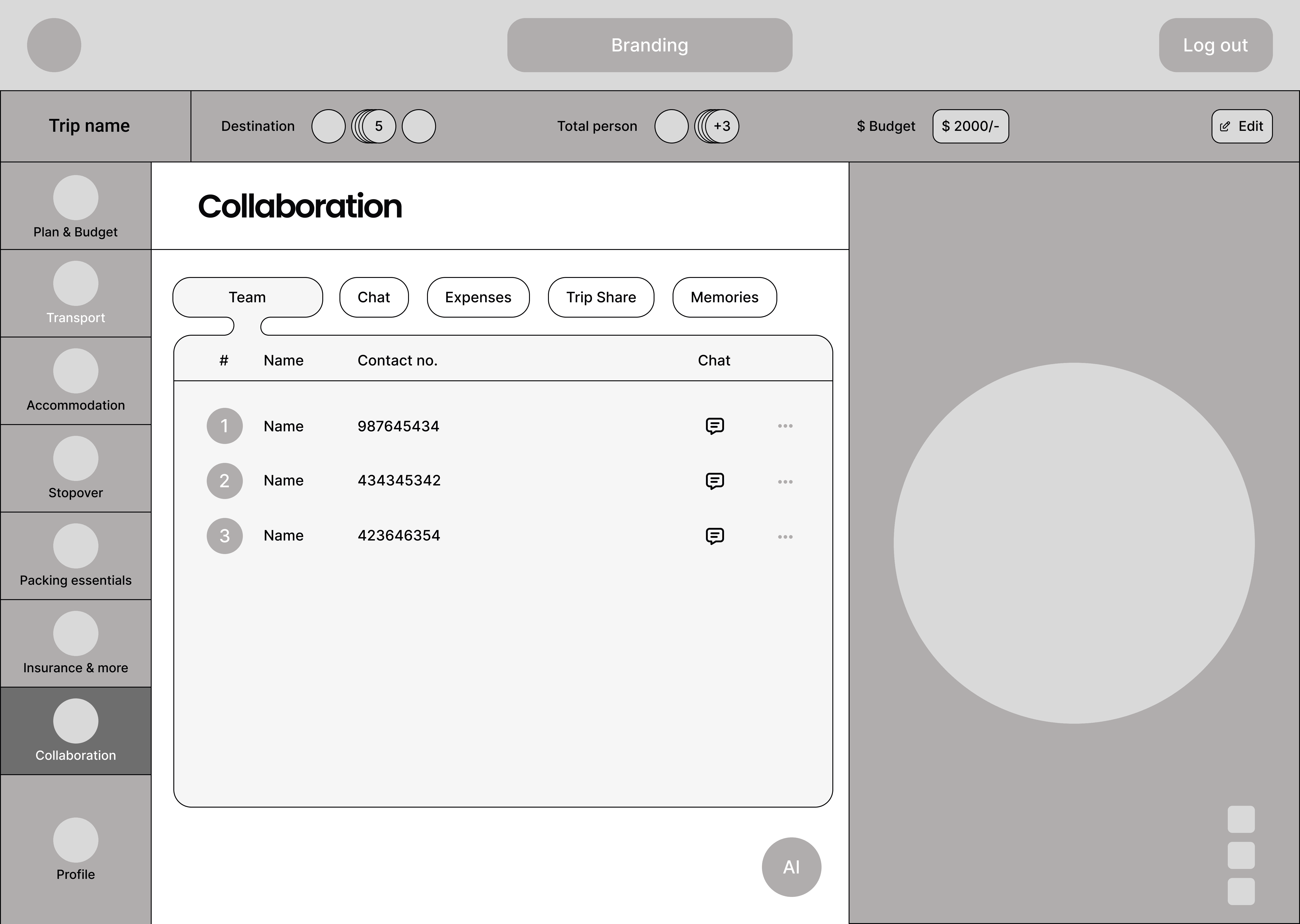
Collaboration
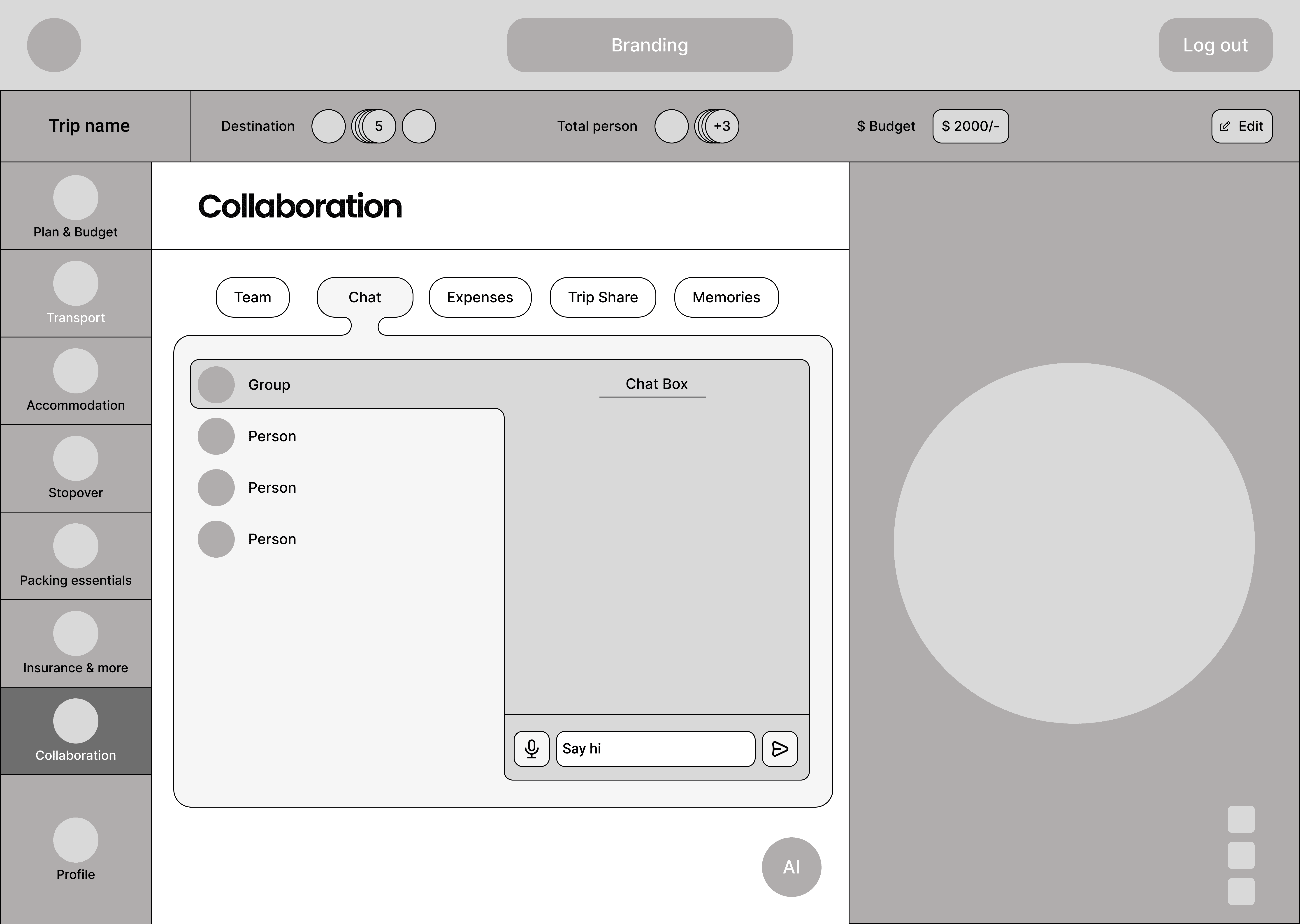
Collaboration 2
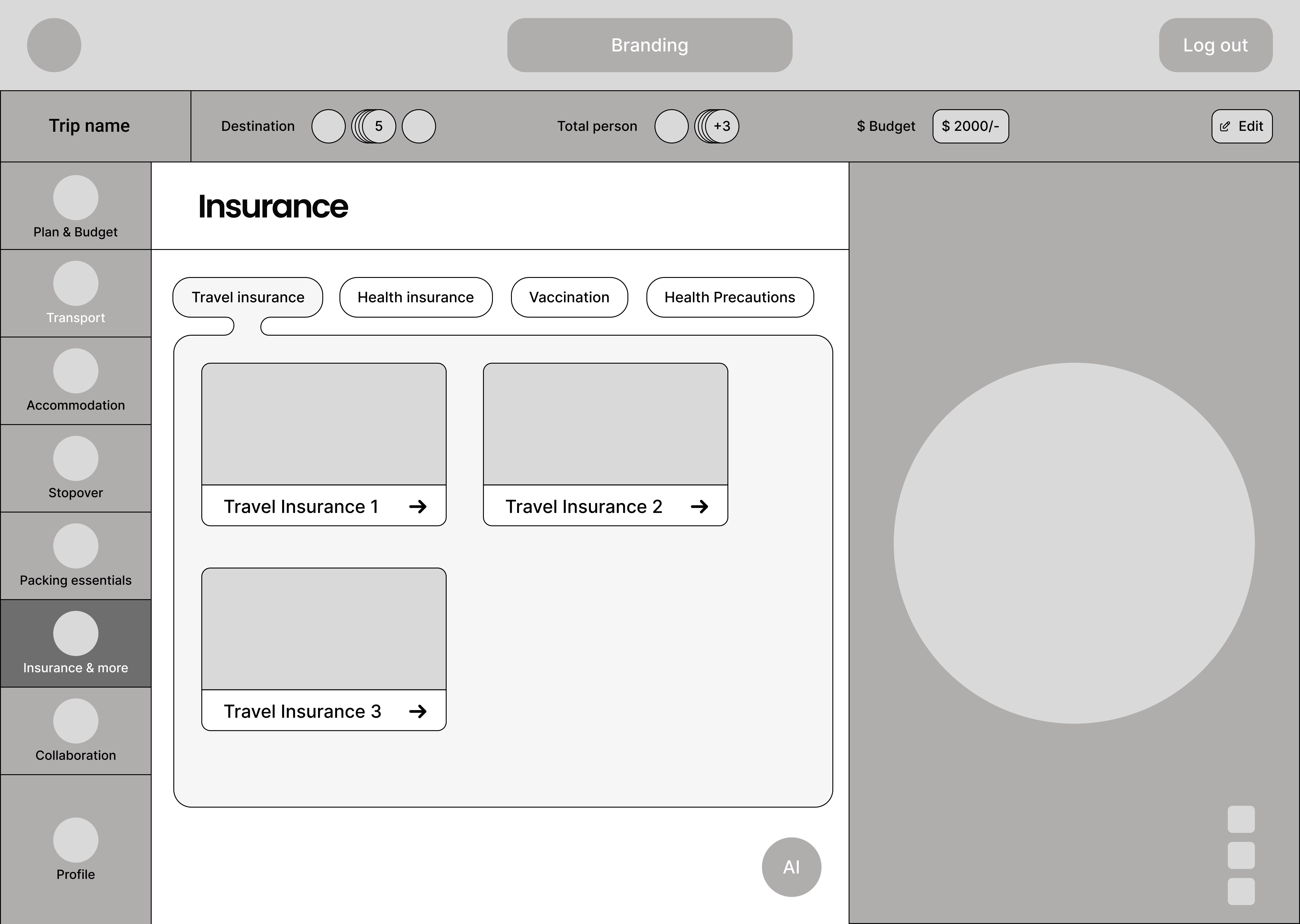
Insurance & more
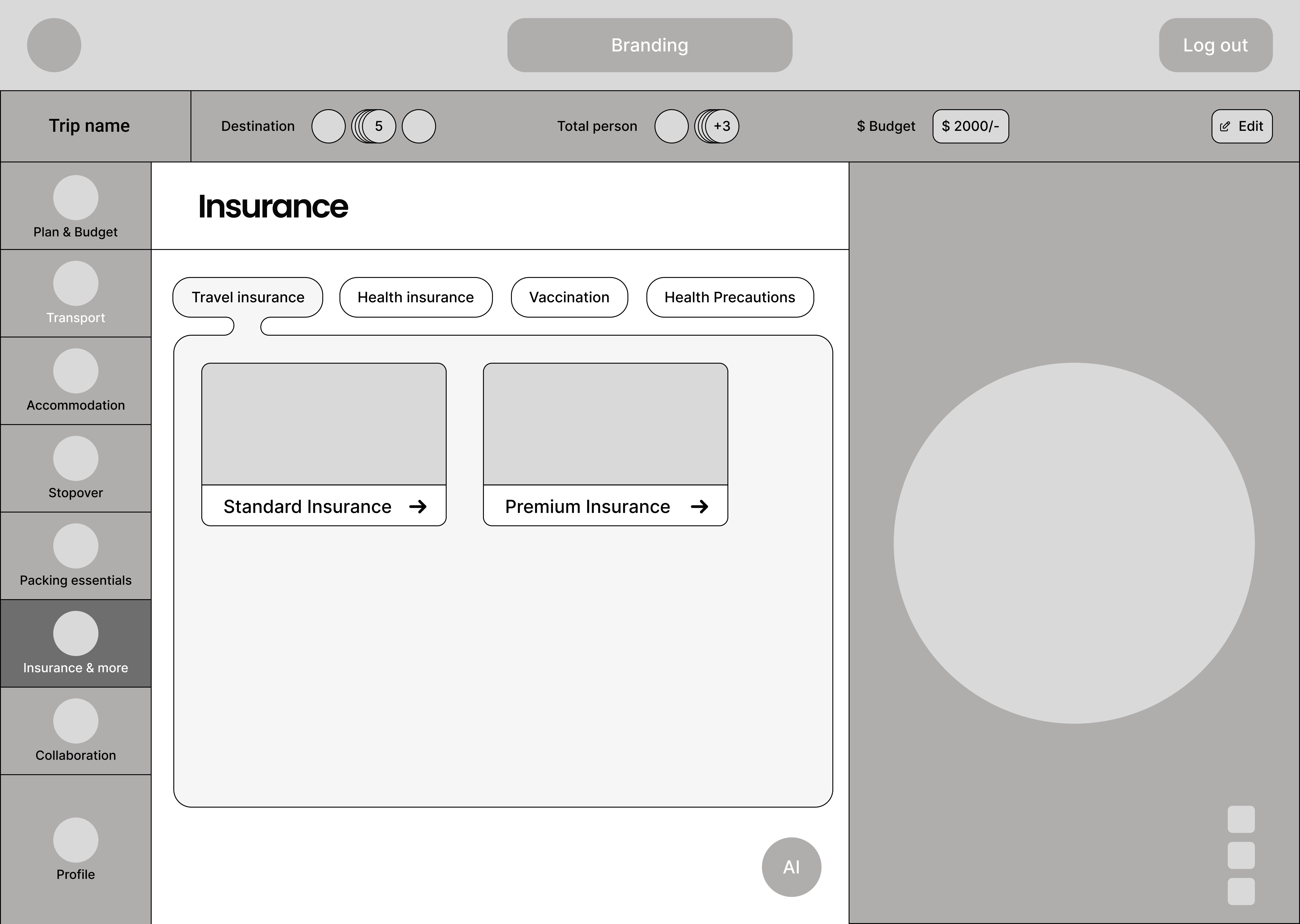
Insurance & more 2
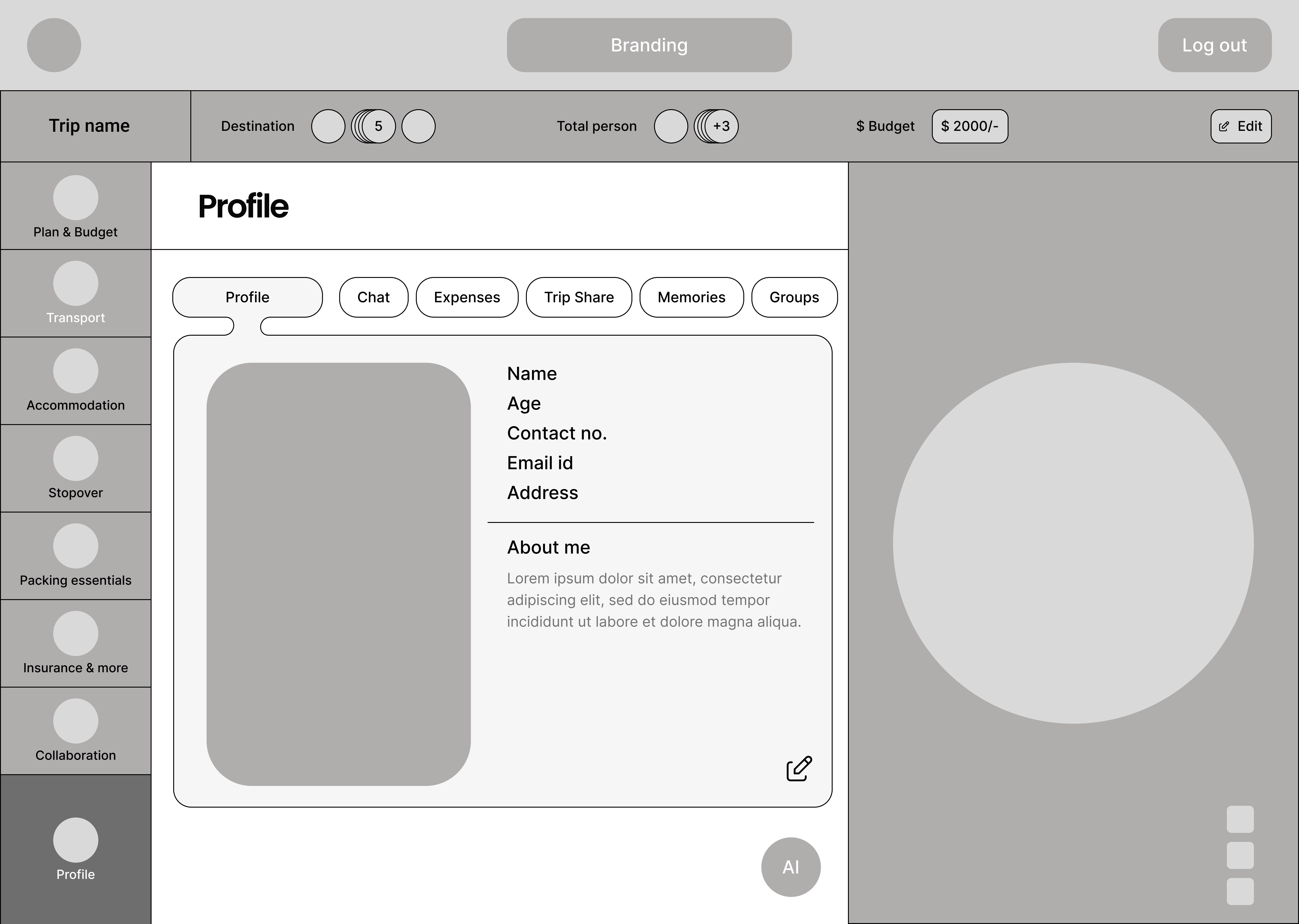
Profile
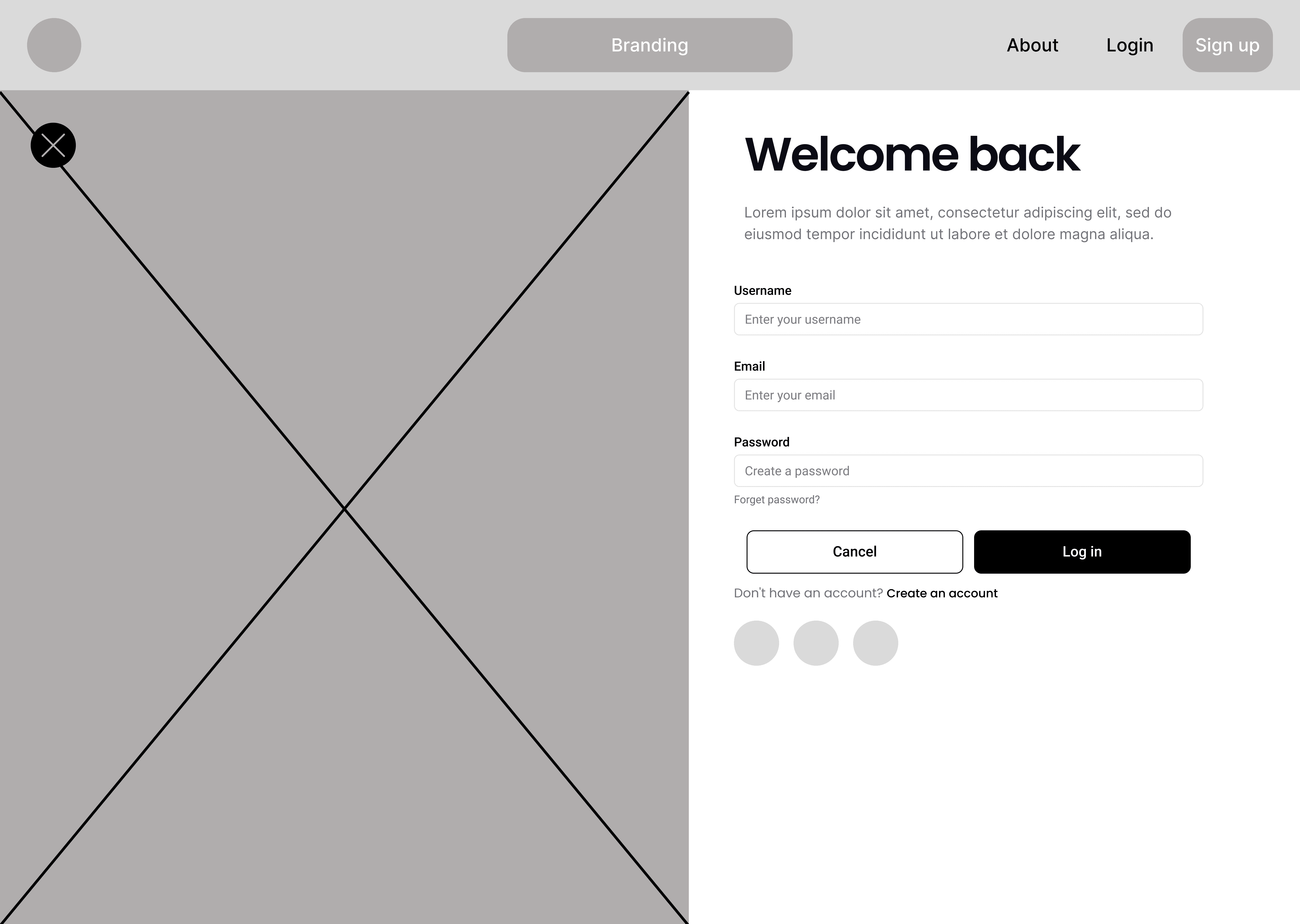
Log in
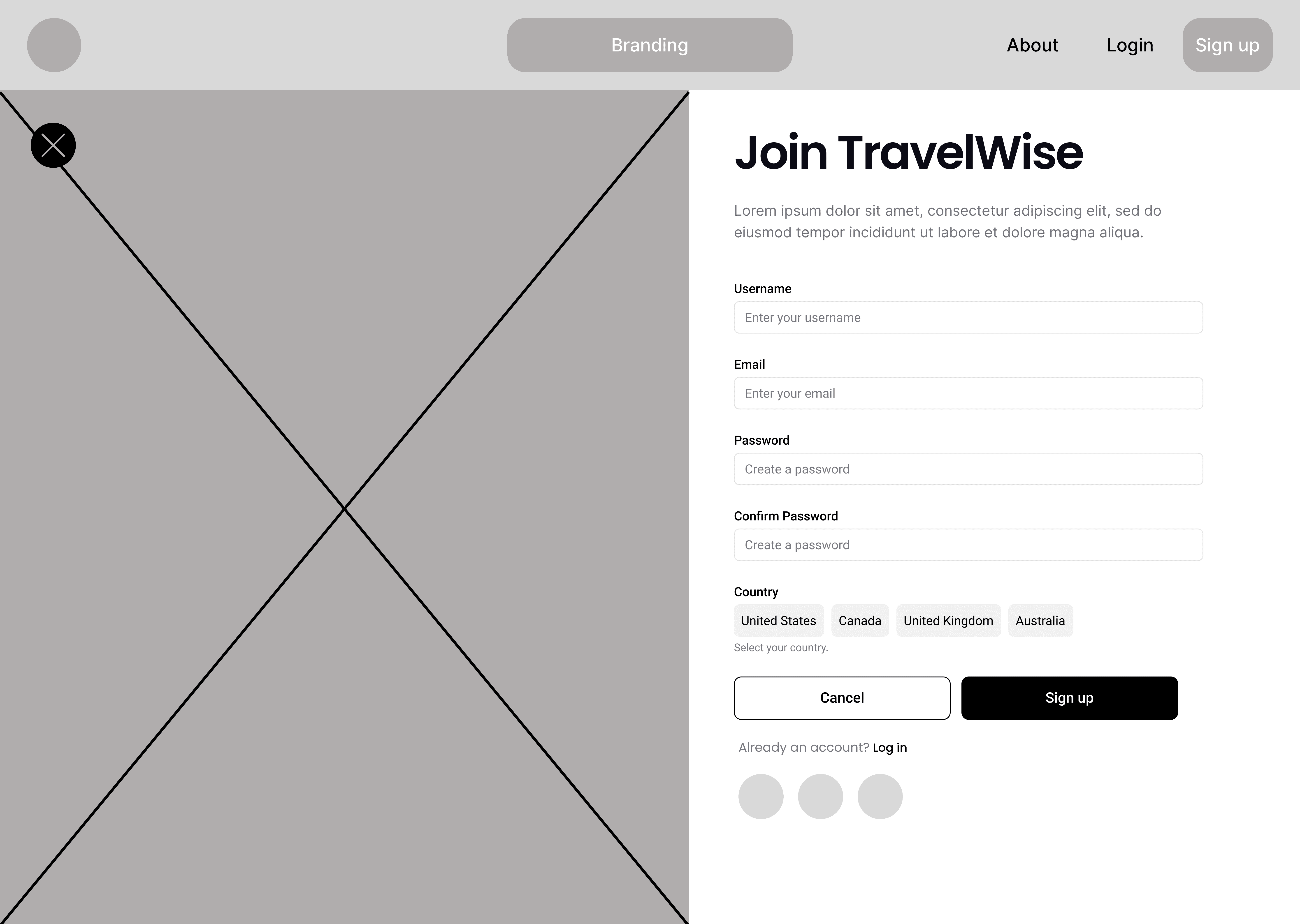
Sign up
06 · Decision 01
Start, destination, currency, budget, dates, travellers: the six fields in order. The system plans within that figure, so it never prices a plan afterwards.
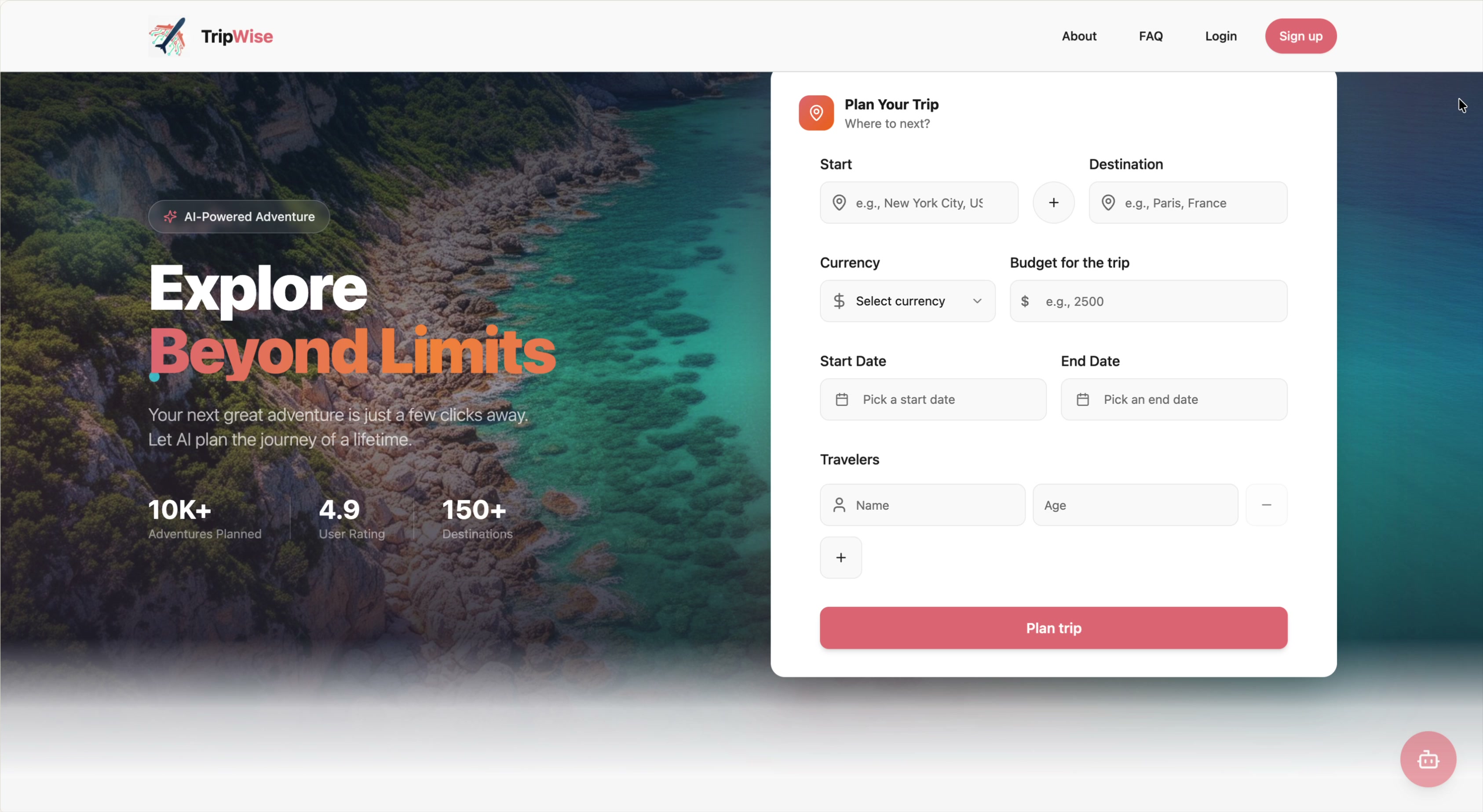
What it cost
It asks for a number from someone who may not have one yet, at the least committed moment. We took the drop-off risk because an optional budget field would be skipped by exactly the people it is for, and everything downstream needs the figure.
07 · Decision 02
The + between start and destination opens numbered stopover rows: New York, Las Vegas for 3 days, San Francisco for 4, Los Angeles. The generated plan keeps those lengths.

What it cost
Every estimate gets harder. Days have to be allocated before costs, so the planner solves time and money together. It is also the clearest reason to pick TripWise over Wanderlog, so it earned the complexity.
The stopover rows are numbered and carry a duration, so the route has lengths before a single price is calculated.
08 · Decision 03
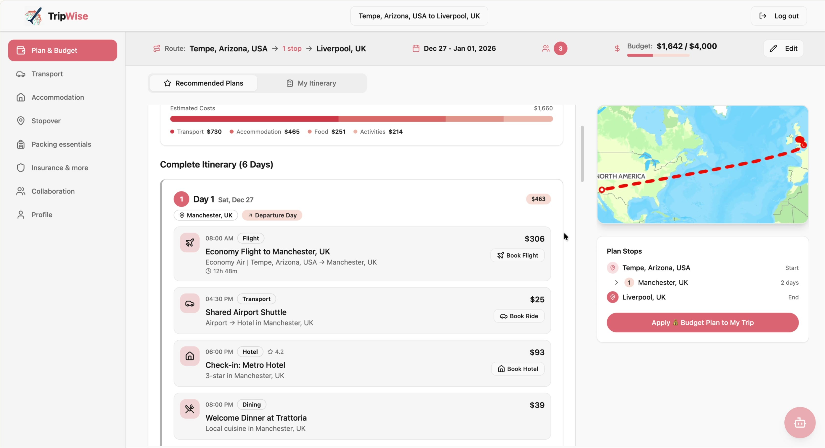
Every item has a price and every day a subtotal. Over budget, the meter turns red and still lets you carry on. You can overspend, but you always know.
What it cost
Money on every surface is noisy, and it can make looking forward to a trip feel like accounting. Itinerary rows also carry a time, a duration and a rating, so cost is not the only thing on the card.
09 · Decision 04
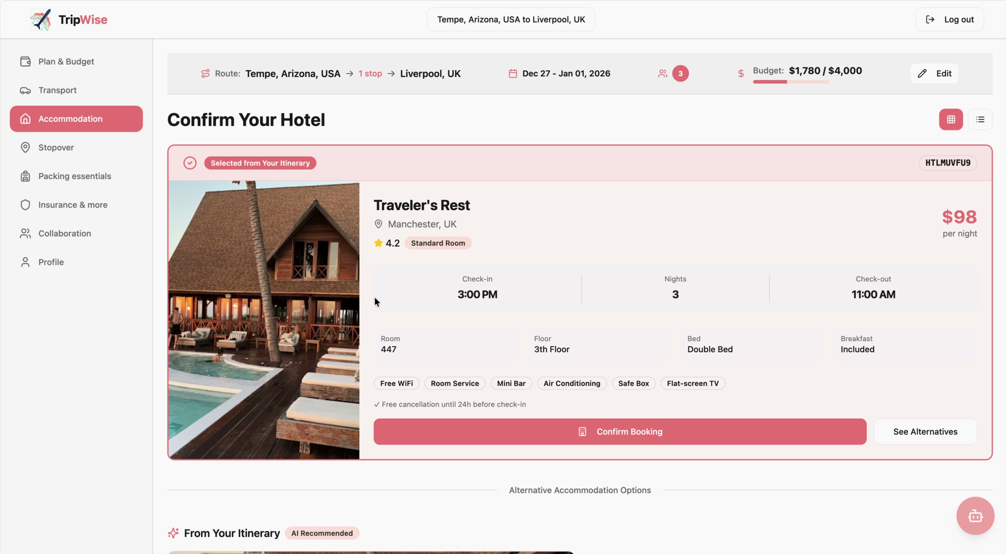
Accommodation opens on the rooms the plan already chose, tagged From Your Itinerary. Changing your mind is a swap inside the plan, and the meter moves as you do it.
What it cost
This promises live inventory and prices we did not own. It is the decision most likely to break against real supplier APIs, and the first I would re-scope with a booking partner.
10 · Decision 05
Expenses works out each person’s fair share and proposes the smallest set of payments that settles the group. In the demo trip, three people and two transfers settle $1,090 of shared spend.

Three people, one debtor, two transfers: the minimum that settles the group.
What it cost
This is a whole product, Splitwise, living inside another one. It is defensible only because the budget system already itemises trip expenses.
11 · Feedback
Five feedback sessions on the prototype, before the build. Nothing was timed or scored. Three gaps came up in more than one session.
Fix 01
“What would the better version cost?”
What we heard
Participants wanted to see the more expensive option, to know what they gave up by staying inside the budget.
What changed
The single plan became two priced tiers, Budget and Premium, switchable in place. Switching rewrites the itinerary, the four-way cost breakdown and the meter at once. Against a $4,000 budget the Premium plan reads $11,874 in red: the meter reports the overrun instead of preventing it.
Fix 02
The desk to street handoff
What we heard
Participants could see a stopover on the map and had no idea how they would get to it on the day. Planning happens at a desk and navigating happens on a phone.
What changed
Every place gained Send Location to Mobile, by SMS, email or QR code, plus Open in Google Maps. We built the handoff to the navigation people already trust, which was also cheaper than building navigation. The QR code needs no account and no typing.
Fix 03
Chasing people for money
What we heard
Splitting the bill was solved. Participants said collecting it afterwards was the unpleasant part of group travel.
What changed
Expenses gained a settlement summary and a payment reminder that writes the message and sends it by email, SMS or in-app. People won’t send a reminder they have to write themselves, so the wording is pre-written and light.
12 · Interfaces
Screen recordings of the build in Lovable. The demo trip is 13 days with two stopovers and a $4,000 budget, planned from an empty form.
Landing page
Start, stopovers, destination, currency, budget and dates: the constraint comes first.
Plan & budget
The generated plan against the meter, with a map and every detail still editable.
AI assistant
Create and adjust the trip in plain language without leaving the plan.
Transport
Flights, bus, car, bike and rail in one flow, opening on the itinerary’s own choice.
Accommodation
Stays matched to the budget and to the day they belong to.
Stopovers
Stops between destinations, each with a length in days.
Packing essentials
The one section people open after the trip has started.
Insurance & more
Insurance is planned inside the trip, before anything is booked.
Collaboration
Team, chat, expenses, reservations and memories in one place.
Profile
Personal details and trip history.
What runs
The stopover chain
The recalculating meter
The two plan tiers
The settlement engine
The mobile handoff
13 · Design system
Inter in three weights, and a coral scale that runs from the primary colour down to a wash for backgrounds.
Primary
#E47878
Hover
#E87E7E
Accent
#ECA5A5
Tint
#F5C4C4
Wash
#FCEAEA
Surface
#FFFFFF
Aa
Inter
One family, three weights, used for everything from the meter to the itinerary rows.
14 · Process
A five-month student project run by three people with no budget for tools. ClickUp held the plan, Miro held the research wall, Figma held the design.
 Figma
Figma ClickUp
 Miro
Miro Google Forms
 Google Meet
 Google Docs
 Google Sheets
 Lovable
15 · Outcomes
A self-directed student project, not client work. There is no revenue line and no adoption curve, so this is what the research produced, what the design changed and what got built.
About performance
No performance claim on this page is a measured one. Our expectations about how much faster budget-first planning would be came from what people told us in research, and they were never tested. Where you would normally read a percentage here, there is nothing.
Not tested
Built, not timed
The claim is that budget-first planning is calmer and faster. No one has been timed against their own tools yet. The study protocol is written.
Research sample
23 travellers, 5 interviews
Enough to shape the structure, not enough to generalise. Most respondents were under 35.
Data
Prices are not live
Flights and stays are sample data. A comparison would favour TripWise on friction and count against it on realism.
16 · Reflection
Research shaped the product, feedback changed three things, and then it was built. No traveller has planned a real trip with the finished product, so every claim about speed or calm is still an argument.
01
Run the study this page is missing
Participants
8 to 10, each planning a real multi-stop trip to a real budget
Design
Timed and counterbalanced: once in TripWise, once in whatever they use now
Measures
Time to a plan they would commit to; how often they go over budget without noticing; how many times they leave for another tab
Outcome
It either earns the number this page doesn’t have, or tells us the idea is wrong
02
Take the placeholder marketing off the landing page
The landing page shows “10K+ adventures planned, 4.9 rating, 150+ destinations” and three named testimonials, on a product with no users. It is placeholder copy on top of honest work, and a careful reviewer would catch it first.
What I kept
