Role
Research, information design
Team
Solo board, team of six
Timeline
Aug to Dec 2024
Tools
Figma, Illustrator, Tobii Pro Lab

At a glance
A course project for TWC 501 at Arizona State University with the Town of Clarkdale, Aug to Dec 2024. Our team of six each designed one sign for Selna Mongini Park, part of the town’s $2.5M renovation. This is mine: one printed board about solar power.
Problem
One board, every age
Families with young children and older visitors share the same park. Most of them give a sign a few seconds.
Approach
The chart is the artwork
A bar chart of one day of solar output fills the board. The cards around it carry one idea each.
Outcome
Handed over, not measured
Eye-tracked with four people, five critique points changed, presented to the town on 7 December 2024. Nobody measured it once installed.
01 · Problem
Nobody comes to a park to read. The board is printed once and stands outside in Arizona sun, with no zoom, no search and no second page. It has to work for a child, a parent and an older visitor at the same time.

Write less
Loses the older visitor
Cut to what a child will read and the detail is gone. The child skips it anyway.
Write it all
Loses everyone else
The detail is there, and nobody stops long enough to reach it.
Layer it
What shipped
One surface, two reading speeds: the picture for a glance, the cards and steps for whoever stays.
How might we
02 · Research
This is the standard front end of a public project. Its value was that the constraints were settled before any layout existed.
25+
papers and case studies on signage, learning and community engagement, through the ASU Library
56
median age in Clarkdale, from the figures the town gave us. Older visitors are a large share of any audience.
6
dimensions in Clarkdale’s brand guide: pillars, vision, mission, audience, typography and colour
Input 01
Literature
Three rules came out of the reading: hierarchy first, accessibility as a constraint, and visual clarity over completeness. A study of smart facilities in Shenzhen’s parks is where the QR code came from.
Input 02
Precedent review
Interpretive signs already standing in parks and on trails, read from a path at a distance. It is why this board leads with a picture.
Input 03
Community profile
Parents bring young children to the playground, and older couples eat lunch on the benches. Parents want signs that teach their children. Older visitors need large type and high contrast. The park had no signs at all.
Input 04
Field visit
18 September 2024 in Clarkdale: a briefing with the town, then the park. It put the sign beside the solar panels, 3 to 4 feet off the ground, and showed how much midday glare a printed surface has to survive.

Fig. 01 · Briefing from the Town of Clarkdale, 18 September 2024.

Fig. 02 · Working outdoors in Clarkdale the same afternoon.

Fig. 03 · Street signage in Clarkdale. The town’s copper-mining history runs through its brand.
03 · Concept
In October I split the sign into three parts on a whiteboard. The hardware list included an LED screen with live solar output. I dropped it before the first board.

Fig. 04 · Concept whiteboard, October 2024. Information, hardware and graphics, with a live-data screen still on the list.
Kept
The graphics column became the board
A sun-cycle illustration, an energy graph, and icons for the panels and the sun. The information column became the cards.
Dropped
A screen with live solar output
My sign plan says I was unsure a screen would help visitors. Outdoors it is one more thing to power, break and maintain for a small town, so the board stayed printed.

Fig. 05 · My design-thinking notes. Older visitors need large print and high contrast. A QR code stays optional, because not everyone is comfortable with the technology.
04 · Brand system
Rolate for headings, Nexa for body, and a palette of blues, greens, earthy reds and copper taken from the local landscape. I treated the guide as a hard constraint.
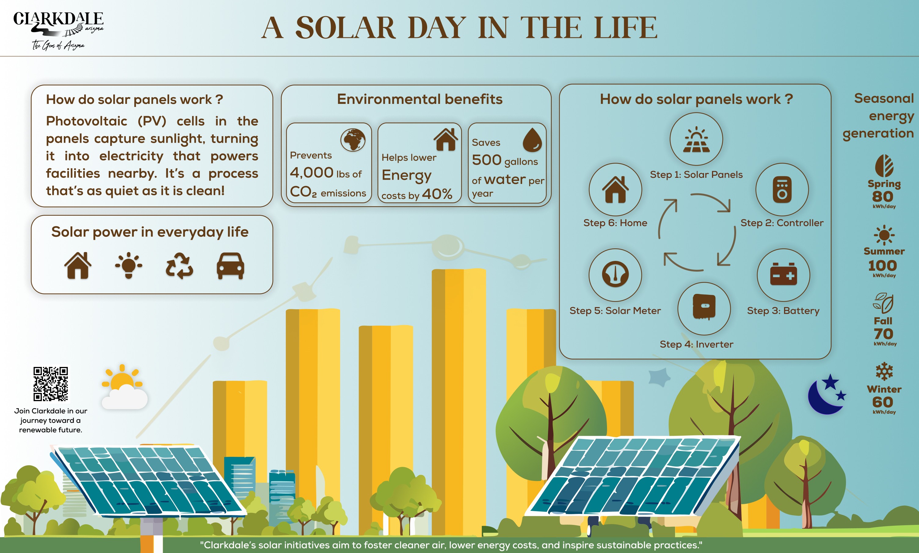
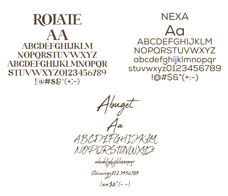
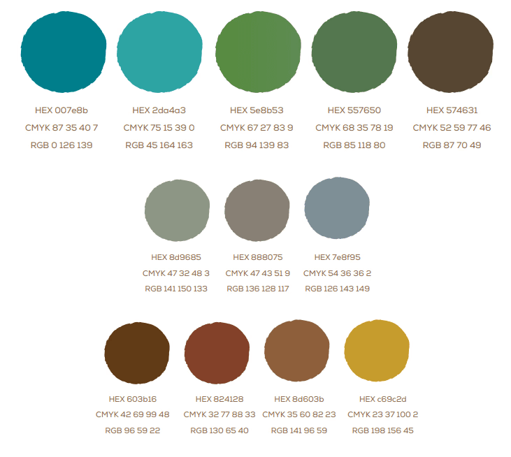
Fig. 06 · Clarkdale’s brand guide, as handed over: logo lockups, typefaces and the landscape palette.
05 · Decision 01
The artwork is a bar chart of one day’s output: bars rising from sunrise, peaking between 11 AM and 4 PM, falling to a moon at the right edge. The cards sit around it.

Fig. 07 · The chart on the final board. Output rises from sunrise, peaks at midday and falls to a moon at the right edge.
What it cost
A chart is less friendly than an illustration, and it takes most of the board. Everything else had to fit around it. The seasonal figures beside it, 80, 100, 70 and 60 kWh a day, were placeholders. My October notes say I wanted the park’s real readings. The final board still carries the placeholders.
06 · Decision 02
The two upper-left cards say what a solar panel does and where solar shows up in ordinary life. The six-step chain from panel to home is there to read, never required.

Fig. 08 · The upper-left cards on the final board. The title became a question: How do solar panels work?
What it cost
It front-loads the least technical content, which reads as simple to an expert. For a public park that is the right trade. For a science museum it would not be.
07 · Decision 03
The everyday-life card uses four icons: a home, a light, recycling and a car. The artwork around the chart has buildings, trees and panels, so the energy lands somewhere a visitor recognises.

Fig. 09 · The lower half of the final board: panels, buildings and trees around the chart.
What it cost
Decoration on an information graphic competes with the data, and a purist would cut it first. The community profile described families who learn by playing, so it stayed.
08 · Decision 04
A QR code in the lower left links to Clarkdale’s renewable-energy work. The board answers the glance and the link answers the interest. The idea came from a study of smart facilities in Shenzhen’s parks.

Fig. 10 · The QR code and its invitation, lower left of the final board.
What it cost
A code on a permanent outdoor sign is a maintenance promise: the page it points to has to outlive the print. My notes also say it must stay optional, since not every visitor is comfortable with a phone.
09 · Testing
The first board went through Tobii Pro Lab with four participants, against six evaluation criteria our team split between us. It shows where attention went and in what order. It cannot say which version is better.
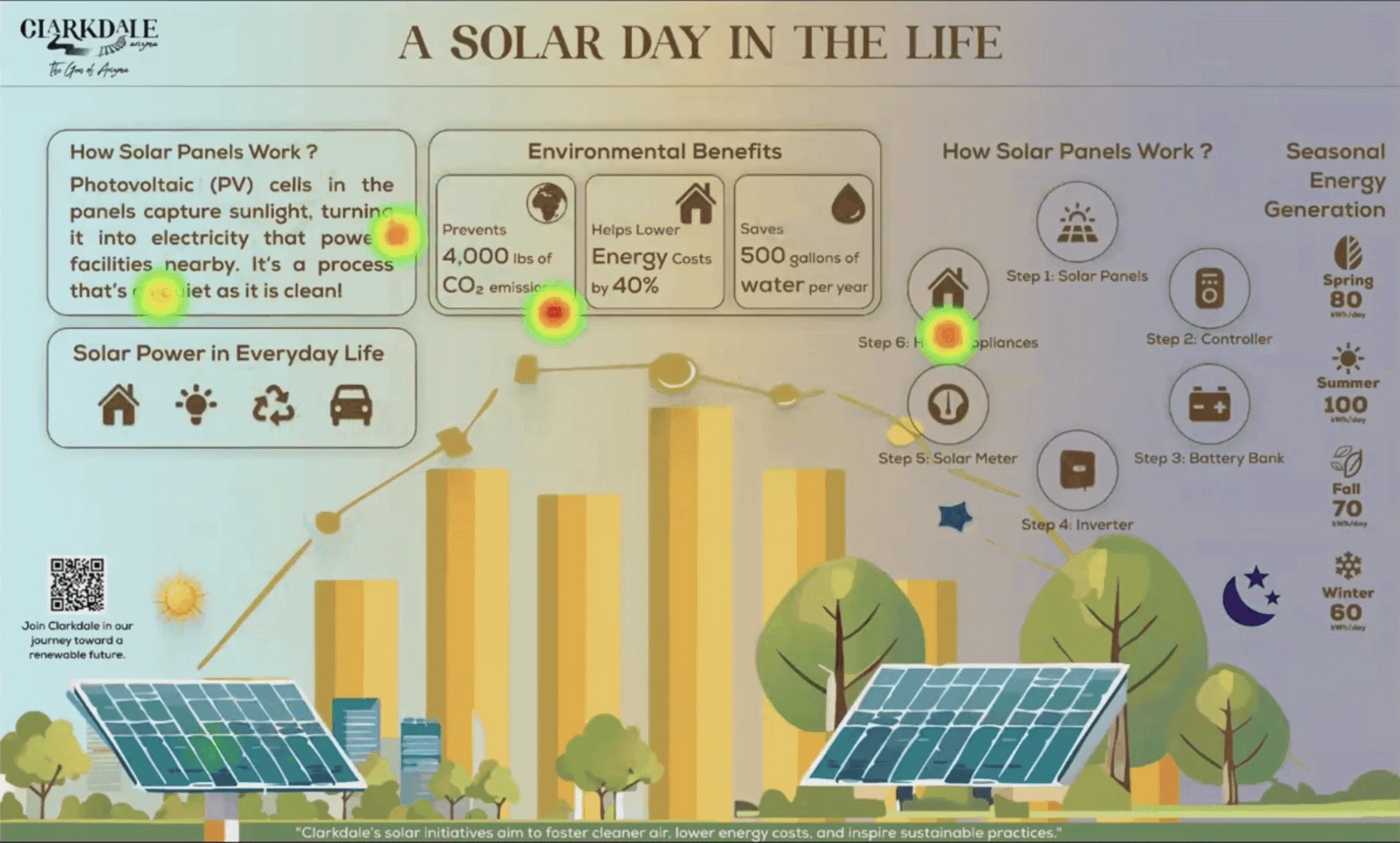
Fig. 11 · Tobii Pro Lab heat map over the first board, four recordings combined. Hover a number to see the finding. The software’s webcam panel is cropped out.
Fig. 12 · Eight seconds of one participant on the first board.
My read at the time
Text drew attention first and held it longest. The graphics were noticed after. So the board’s key figures had to stand out more, and the step chain needed more room and a clear order. Four people are enough to say where attention went, and not enough to say one version is better.
01
Ease of learning (mine)
Do titles, key terms and icons draw the eye first, and how long do people spend on the detailed parts?
02
Navigation
Does the eye move in the order the content assumes?
03
Language
Is the wording short and approachable for a mixed-age reader?
04
Organisation
Does the layout hold a reading sequence without instructions?
05
Maintenance
Can it survive weather and be updated without a redesign?
06
Accessibility
Contrast, type size and layout clarity for readers with low vision.
Team Technology split six evaluation criteria between its six members. Ease of learning was mine.
10 · Iteration
The first board went to the eye tracker and to three reviewers at the same time: our instructor and two reviewers from the Clarkdale side. I marked five problems on the first board and the five fixes on the final one.
Fix 01
Step direction
Numbered steps in one card, with arrows.
Fix 02
Overlap
Labels off the artwork, which sits behind a card.
Fix 03
Gradient
Purple out, the town’s teal gradient in.
Fix 04
Interactive features
The QR code kept as the route to more.
Fix 05
Icon consistency
One sun, drawn to match the icon set.
Also changed, and not changed
Headings moved to sentence case, and the step title became a question. My reflective memo also lists a note on the water figure and an average-household note on the seasonal column. Neither is on the final artwork file I have.

Fig. 13 · First board, annotated with the five problems.

Fig. 14 · Final board, annotated with the fixes.
11 · Process
Solo design inside a six-person team, from reading in August to the handover on 7 December 2024. Figma and Illustrator for the board, Tobii Pro Lab for testing, Google Docs for the copy.
 Figma
Figma Adobe Illustrator
 Google Docs
 Google Scholar
Tools
Figma and Adobe Illustrator for the board and the chart, Tobii Pro Lab for the eye tracking, the ASU Library and Google Scholar for the reading, and Google Docs for the copy and the memos.
12 · Outcomes
The board was presented to the Town of Clarkdale on 7 December 2024 and is installed at Selna Mongini Park. Everything else here is a count or a trace, labelled with its source.
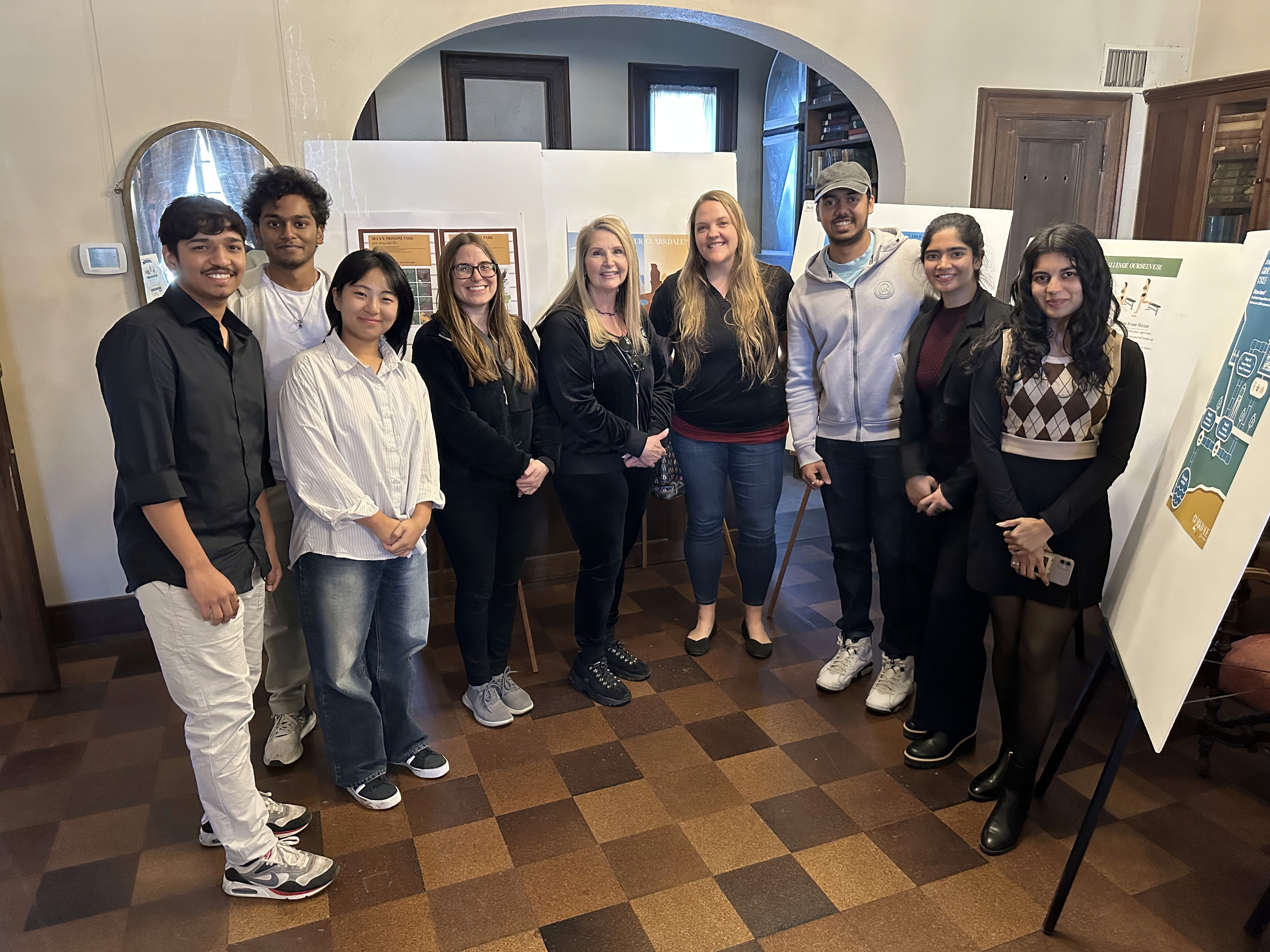
Fig. 15 · Handover presentation to the Town of Clarkdale, 7 December 2024.

Fig. 16 · Presenting the printed board at the handover.

Fig. 17 · The final board on screen.
About the numbers
An earlier write-up claimed a 35% rise in engagement, 40% easier learning and 60% accessibility compliance. None of them was measured, so none is on this page. Sixty per cent would have been a failing compliance result anyway.
13 · Reflection
One move worked, one limitation stands, one fix is overdue, and half a day on site would settle what the eye tracker could not.
What worked
The data is the artwork
Making the chart the artwork is why the board says anything to someone walking past. I would reach for it again anywhere the first read is involuntary.
The limitation
Nobody went back to the park
The board was eye-tracked before it was finished and never tested after it was installed. Every claim about what it teaches rests on four people, indoors, on a screen.
Overdue
Put real numbers on the board
4,000 lbs of CO2, 40% lower energy costs, 500 gallons of water and the seasonal kWh were illustrative. I flagged the water figure myself in November and it still shipped. The park’s panels produce real readings, and the board should carry them.
Next time
Half a day on site
Two hours at three times of day, counting stop rate and dwell time against a nearby sign with no chart, plus one question for visitors: what does the yellow shape mean?
What I kept
