A drone ground station sized to the people who sit in it. Designed by a team of five, never tested with operators.

A drone ground station sized to the people who sit in it. Designed by a team of five, never tested with operators.

A drone ground station sized to the people who sit in it. Designed by a team of five, never tested with operators.

Role

UX research, display design

Team

Team of five

Timeline

Fall 2024

Tools

Figma, Miro, Illustrator

The three control units: the navigator's case with keyboard, the payload operator's dual-screen case and the pilot's handheld

One station, three control units: the navigator’s case, the payload operator’s dual-screen case and the pilot’s handheld, each carrying only what its role needs.

At a glance

The drone is the easy part. The room around the operators is the design problem.

The drone is the easy part. The room around the operators is the design problem.

The drone is the easy part. The room around the operators is the design problem.

A graduate human factors project for HSE 542 at Arizona State University, fall 2024. Five of us shared the research, the display concepts and the ergonomic analysis.

Method

Nothing drawn before it was measured

The mission broke into tasks, the tasks into three roles, and the workspace was sized to the 5th through 95th percentile instead of an average.

Output

Four screens, three controllers, one shift plan

Fifteen display principles shape the screens, one alert scheme covers every role, and ten hours of work sit inside a twelve-hour shift.

Status

Never built, never deployed

Coursework, presented in class. There are no measured outcomes, and no operator has used any of it.

01 · Problem

A ground station is a workstation first. Software is only the part that gets redesigned.

A ground station is a workstation first. Software is only the part that gets redesigned.

A ground station is a workstation first. Software is only the part that gets redesigned.

UAVs monitor soil health, irrigation and crop condition, and most of the flying is automated. The screens, the seat, the controls and the shift schedule decide whether an operator still reads a sensor anomaly correctly at hour ten.

12:00 PM
One screen · every role
Live camera view
Satellite map
Drone state
Altitude 187 · Speed 127 knots
Temperature 35°F · Battery 50%
Object detection radar
Route information
Waypoints A to E
Multispectral
Sensor bands
Red 0.34 · Green 0.45 · Blue 0.30
NIR 0.65 · Red edge 0.50 · NDVI 0.31
Camera settings
Soil moisture
▲ anomaly
The shift
Hour 0 of 12
0 h12 h
A sensor anomaly appears in one of ten panels.
The pilot, the navigator and the payload operator are all looking at the same glass. Whether anyone reads it correctly depends on the seat, the layout and the hours as much as the software.

Five ways the workstation works against the operator, from secondary research and a review of existing ground control stations

Body

Fixed seating

Seating and reach are set around an average body and held for twelve hours, so musculoskeletal strain follows.

Display

Overload

Every role is shown everything, so what matters competes with what does not.

Hands

One size

Controls ignore the range of hand sizes and reach that will use them.

Fatigue

No recovery

Shifts run long and breaks are taken when there is a gap, not scheduled against fatigue.

Station

Fixed layout

The station cannot be reconfigured for a different mission, crew size or role split.

How might we

How might we give each operator only what their task needs, and keep them reading it correctly in the tenth hour of a shift?

How might we give each operator only what their task needs, and keep them reading it correctly in the tenth hour of a shift?

02 · Research

Task analysis before layout. The roles came out of it.

Task analysis before layout. The roles came out of it.

Task analysis before layout. The roles came out of it.

We walked the mission from pre-flight through survey to data handoff, and asked what each person needs in front of them at the moment they decide. The concept gave one VTOL airframe seven jobs.

The mission · one VTOL UAV
Crop health assessmentPollination assistanceCrop dustingDisease detectionSoil health assessmentLivestock monitoringIrrigation optimization
task analysis
Pilot
Controls flight path, altitude and speed
Key information
Flight parametersEnvironmental conditionsSystem status
1 screen · handheld controller
Navigator
Manages route planning and updates
Key information
MapsWaypointsCoverage areasEnvironmental data
1 screen · case with keyboard
Payload operator
Manages sensors and data collection
Key information
Sensor readingsCrop health dataSoil conditionsData storage status
2 screens · dual-screen case
Three boxes: Pilot, Navigator and Payload operator, each with its role and key information

Three roles, three information needs. The roles are the output of the task analysis.

What this research was

Secondary research, a review of existing ground control stations, the human factors literature and anthropometric tables. We did not interview or observe UAV operators.

03 · Roles

One station, three jobs. Each role gets its own screen.

One station, three jobs. Each role gets its own screen.

One station, three jobs. Each role gets its own screen.

Each role got a purpose-built screen instead of a filtered view of a shared one. The payload operator is the only role with two.

Flight

Pilot

Works outside, standing or seated, with a handheld controller: a heads-up display, haptic feedback in the sticks and an emergency override.

One screen, on the handheld

Route

Navigator

Sits inside at a large adjustable monitor with a real-time map and a colour-coded control panel, built for route planning and waypoints.

One large screen, in a case with a keyboard

Sensors

Payload operator

Sits inside with dual screens, live feeds on one and analysis on the other, with heat maps and colour gradients to read crop health.

Two screens, in a dual-screen case

04 · Principles

Fifteen principles, four screens. Each one shows up somewhere.

Fifteen principles, four screens. Each one shows up somewhere.

Fifteen principles, four screens. Each one shows up somewhere.

The course textbook groups fifteen display design principles under attention, perception, memory and mental models. We used them as a checklist for every screen.

Attention4
A1Salience compatibility
A2Minimize information access cost
A3Proximity compatibility
A4Avoid resource competition
AppliedPilot
Alerts in bold, contrasting colour at the top centre, where they are seen first.
Perception5
P5Make displays legible
P6Avoid absolute judgment limits
P7Support top-down processing
P8Exploit redundancy gain
P9Make discriminable
AppliedPayload operator
Multispectral and infrared views colour-code healthy and stressed crop.
Memory4
M10Knowledge in the world
M11Support visual momentum
M12Provide predictive aiding
M13Be consistent
AppliedNavigator
Waypoints and map details sit in the same place on every mission.
Mental model2
MM14Pictorial realism
MM15Moving part
AppliedPilot
The layout mirrors traditional cockpit controls, and gauges read like physical ones.
Principles from Lee, Wickens, Liu and Boyle, Designing for People (2017), table 8.2. Applications from the team's final deck.

Attention

Alerts in bold, contrasting colour

On the pilot screen they sit at the top centre, where they are seen first.

Perception

Colour for crop health

The payload operator’s multispectral and infrared views colour-code healthy and stressed crop.

Memory

The same place every mission

The navigator’s waypoint list and map details never move.

Mental model

A cockpit, not an app

The pilot layout mirrors traditional cockpit controls, and gauges read like physical ones.

Principles from Lee, Wickens, Liu and Boyle, Designing for People (2017), table 8.2. Where they apply comes from the team’s final deck.

05 · Blocking

Layout decided on paper first. Figma came after the whiteboard.

Layout decided on paper first. Figma came after the whiteboard.

Layout decided on paper first. Figma came after the whiteboard.

We blocked out every screen by hand before anyone opened Figma. Where the camera view sits relative to the map is a layout question, and paper answers it fastest.

Whiteboard · pilot screenFigma · pilot screen
CAMERA VIEW
DRONE INFORMATION
SATELLITE MAP
ALERT SECTION
CAMERA SETTING
DRONE CONTROLLER
What moved
The camera view kept the top left and grew. The satellite map gave up width to the alert section. Nothing changed rows.
Labels on the left are the ones on the whiteboard. Labels on the right are the ones on the final pilot screen.
Hand-drawn blocking of the pilot, navigator and payload operator screens on a whiteboard

Screen blocking by hand for all four screens. The payload operator’s second screen was settled here, before anyone opened Figma.

06 · Decision 01

A screen for each role. The pilot and the navigator see the same data in opposite order.

A screen for each role. The pilot and the navigator see the same data in opposite order.

A screen for each role. The pilot and the navigator see the same data in opposite order.

Filtering one shared screen is cheaper, and most ground control software does it. It also leaves unused controls on the glass to look past while deciding.

PilotNavigatorSame panels. The satellite view takes the primary position, and the camera drops to a reference.
Live camera view
Satellite view
Drone state and telemetry
Radar
Alerts and camera settings
Route information
Annotated pilot screen

Pilot. Live camera view dominant, telemetry banked right, satellite map and alerts along the base, and the controller mirrored bottom right so hand and screen agree.

Annotated navigator screen

Navigator. The satellite view takes the primary position, the camera drops to a reference view on the right, and route information runs along the bottom.
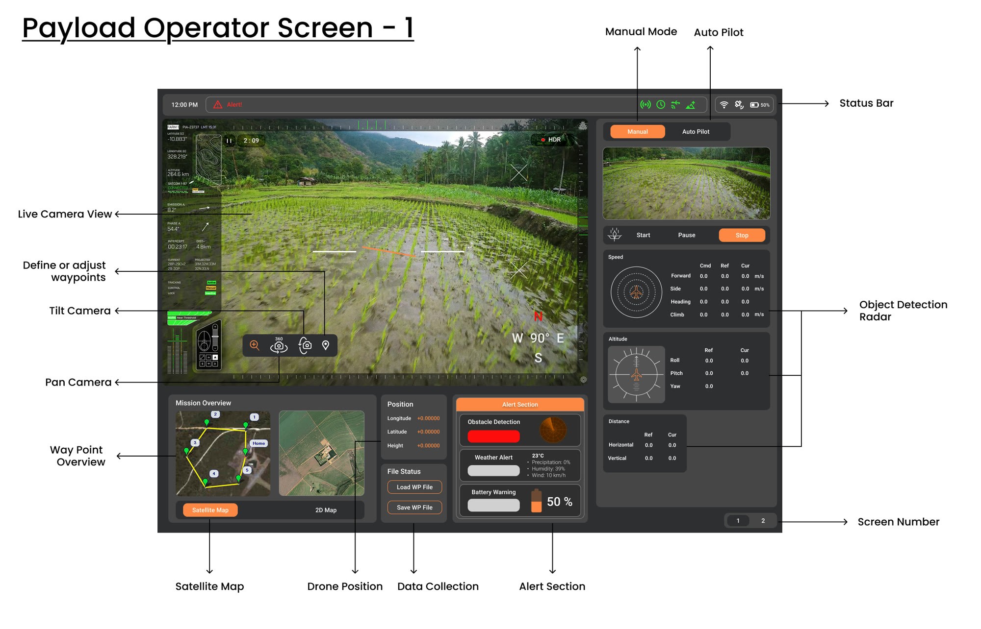
Annotated payload operator screen one

Payload operator, screen one. Capture controls and the object detection radar, with pan and tilt under the camera view instead of in a menu.

Annotated payload operator screen two

Payload operator, screen two. Sensor bands and crop health readings are why this role needs a second display and the other two do not.

07 · Decision 02

Two alert levels, the same on every station. Yellow warns, red interrupts.

Two alert levels, the same on every station. Yellow warns, red interrupts.

Two alert levels, the same on every station. Yellow warns, red interrupts.

A yellow warning is something the operator should notice. A red alert interrupts, with its own icon and a tint across the view. The serious ones also have a sound, so they land when the operator is looking elsewhere.
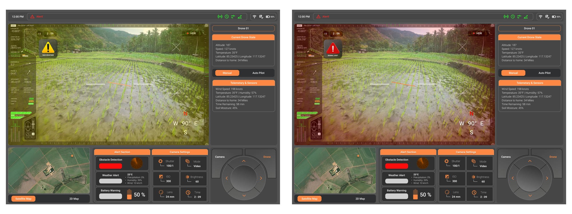
Live camera view · pilot
Current Drone State
Altitude 187
Speed 127 knots
Temperature 35°F
Distance to home 34 miles
Alert Section
Obstacle detection
Weather alert
Battery warning
Yellow for warningsRed for alertsSame two levels on all three stations
Auditory alerts
Low battery
Medium pitch, 3 beeps every 5 seconds
+ Flashing red icon
Obstacle proximity
High pitch, rapid beeping
+ Red zone on the map
Critical failure
Loud descending tone
+ Full-screen red fault overlay
Pilot screen with a yellow warning and the same screen with a red alert

Pilot. A warning the operator should notice, then an alert that interrupts.
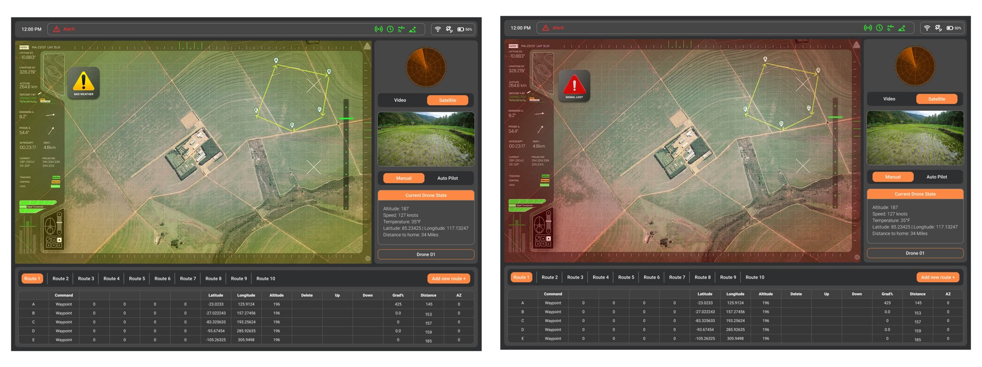
Navigator screen with a yellow warning and with a red alert

Navigator. The same two levels, so an operator can move between stations without relearning them.
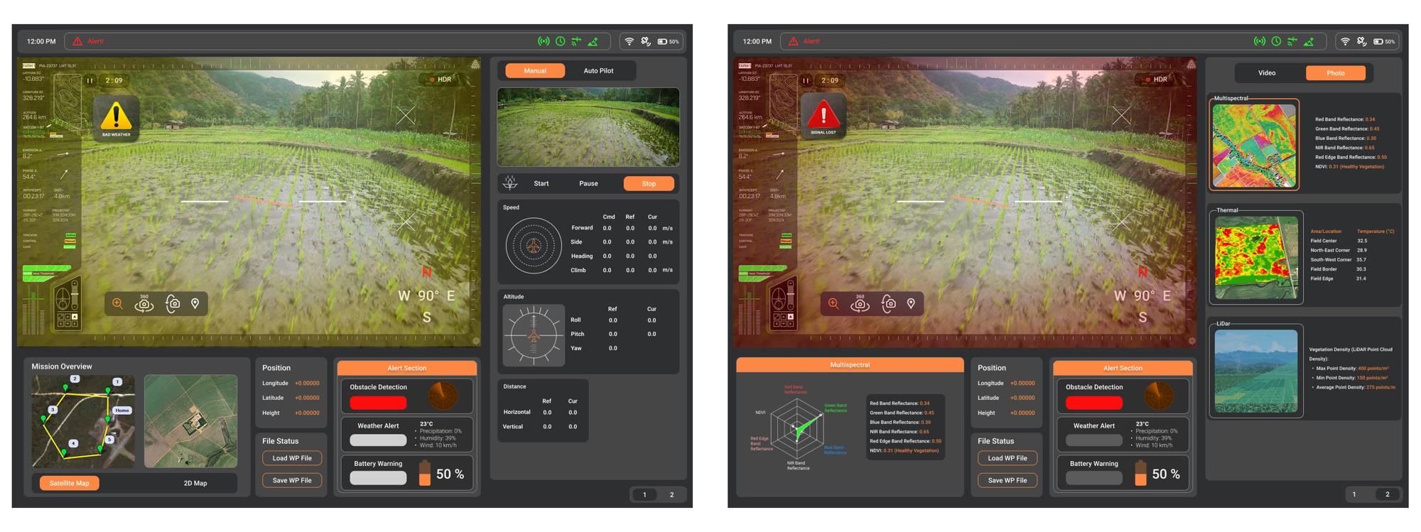
Payload operator screens with a yellow warning and with a red alert

Payload operator. Sensor and capture failures use the same two levels instead of a third one for data problems.

Low battery

Medium pitch, 3 beeps every 5 seconds, with a flashing red icon.

Obstacle proximity

High pitch, rapid beeping, with a red zone on the map.

Critical failure

A loud descending tone, with a full-screen red fault overlay.

08 · Decision 03

Automate the tedious parts. The release decision stays human.

Automate the tedious parts. The release decision stays human.

Automate the tedious parts. The release decision stays human.

We split every role’s work into what the system handles and what the operator keeps. Automation takes the difficult, tedious or dangerous tasks. Judgement, emergencies and the final payload release stay with a person.

Automated
Difficult, tedious or dangerous work
Operator decides
Context, judgement and release
Pilot
Route optimization and autopilot
Obstacle detection and avoidance
Emergency manoeuvres
Situational assessments that need judgement
Navigator
Real-time data analysis and terrain mapping
Switching between camera and satellite views
Strategic route adjustments for the mission
Verifying critical data and course corrections
Payload operator
Target tracking and deployment coordination
Monitoring payload status for alerts
Final decision on payload release
Adjusting camera angles for clarity
Risks the deck names for the automated side: trust and reliability, complacency, mode confusion.

Pilot

Automated: Route optimization and autopilot. Obstacle detection and avoidance.

Operator decides: Emergency manoeuvres. Situational assessments that need judgement.

Navigator

Automated: Real-time data analysis and terrain mapping. Switching between camera and satellite views.

Operator decides: Strategic route adjustments. Verifying critical data and making course corrections.

Payload operator

Automated: Target tracking and deployment coordination. Monitoring payload status for alerts.

Operator decides: The final decision on payload release. Adjusting camera angles for clarity.

What it costs

Automation brings its own failure modes. The deck names three to design against: trust and reliability, complacency, and mode confusion. That is why a manual and autopilot switch sits on every role’s screen.

09 · Decision 04

Hands before screens. The controller carries as much design as the display.

Hands before screens. The controller carries as much design as the display.

Hands before screens. The controller carries as much design as the display.

Each controller was laid out with seven control arrangement principles. Haptic feedback in the control sticks marks the limits of the flight envelope, and an emergency override sits on the pilot’s handheld.
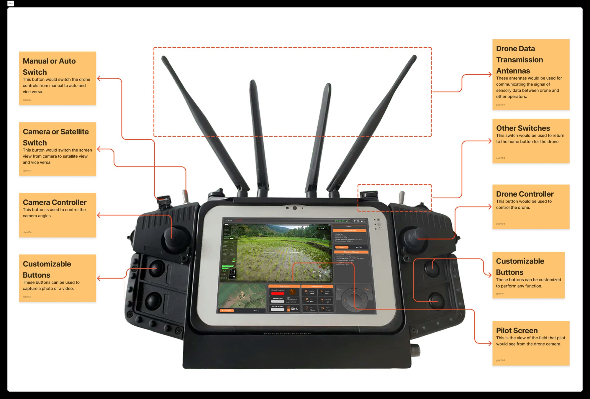
Annotated pilot handheld controller

Pilot. Mode switches sit where a glance can confirm them, and customisable buttons carry the captures a pilot repeats all shift.
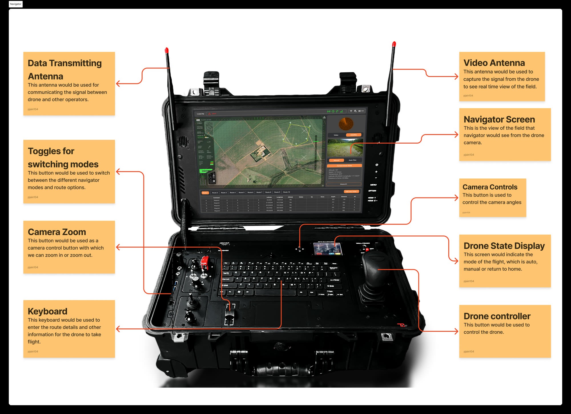
Annotated navigator case with screen, keyboard and controls

Navigator. More map work, fewer live controls. Zoom and view controls sit within reach of both hands.

Annotated payload operator dual-screen case

Payload operator. Camera and deployment controls take the dominant positions, with the emergency switch in a fixed place.

Seven control arrangement principles, as applied to the pilot’s controller

Frequency of use

The joystick for camera and drone sits under the thumb.

Importance

Altitude is centred. Battery sits on the edge.

Sequence of use

Camera and satellite view switches sit side by side.

Consistency

Mode and camera controls stay in the same place.

Control-display compatibility

The joystick sits next to the display it moves.

Clutter avoidance

Space around the joystick and toggles prevents accidental presses.

Functional grouping

Flight controls are grouped apart from navigation and camera controls.

10 · Decision 05

Sized to the 5th and the 95th percentile. An average body fits almost nobody.

Sized to the 5th and the 95th percentile. An average body fits almost nobody.

Sized to the 5th and the 95th percentile. An average body fits almost nobody.

We worked two body dimensions across the 5th to 95th percentile and turned them into adjustment ranges: seated eye height for the displays and grip breadth for the controls. The chair follows the same rule.

Seated eye heightSets the display height
0.00 to 0.00 inmean 30.1 · SD 3
Grip breadthSets the control panel
0.00 to 0.00 inmean 1.85 · SD 0.213
X = X̄ ± 1.645 × SDOperators aged 20 to 60, men and women. Worked from the sample means and deviations in the deck, then built in as adjustment ranges.

25.17 in

Seated eye height, 5th

35.04 in

Seated eye height, 95th

1.50 in

Grip breadth, 5th

2.20 in

Grip breadth, 95th

Worked with X = mean ± 1.645 × SD from the sample means and deviations in the deck, for operators aged 20 to 60.

The station chair with its adjustment ranges labelled

The chair, labelled with its ranges: mid-back height 18 to 20 inches, lumbar support 6 to 10, armrests 7 to 10 above the seat and foldable, seat depth 14 to 16, width 17 to 19.

Seat

Adjustable chair

Seat height adjusts from 12 to 20 inches, and depth, width and backrest tilt adjust too, so no single posture is fixed.

Back

Lumbar sized to the range

A curve set for the mean is wrong at both tails, so the lumbar support moves through 6 to 10 inches.

Front edge

Waterfall seat edge

A rounded front edge reduces pressure behind the knee across a twelve-hour seated shift.

Mount

Built for a moving station

Shock absorption and vibration damping, locking casters, a swivel lock and a seat belt for transit.

11 · Workspace

A control centre that drives to the field. The station lives in a vehicle.

A control centre that drives to the field. The station lives in a vehicle.

A control centre that drives to the field. The station lives in a vehicle.

The station is housed in a large vehicle, such as a bus, so it can set up at different mission sites. The navigator and the payload operator work inside. The pilot works outside with the handheld controller.

Render of a white bus marked Agricultural UAV Control Center with a drone on its roof

The control centre as a vehicle, a team render.

Top-down cutaway of a shelter with three operator seats facing a wall of screens

A three-seat station layout, from the same boards.

Modular

Adjustable by design

Flexible monitor mounts, ergonomic seating and managed cable runs, so each operator can set up their own station.

Communication

One crew, one channel

An integrated intercom and digital systems for real-time coordination between the three roles.

Environment

Comfort for long shifts

Climate control and noise insulation inside the vehicle.

Portability

Quick to deploy

Fast to set up and reconfigure at a new mission site.

12 · Shift

Recovery is on the schedule. Every break has a time.

Recovery is on the schedule. Every break has a time.

Recovery is on the schedule. Every break has a time.

A twelve-hour shift holds ten hours of work in 90-minute blocks, five 15-minute walking breaks and a 45-minute extended break at 1:00. We estimated energy use for the whole shift at about 1,279 kcal.

One operator · 8:00 to 8:00
90 min
90 min
90 min
45
90 min
90 min
90 min
60 min
8:00
9:30
11:15
1:00
3:15
5:00
6:45
8:00
Work15-minute break, walking45-minute extended break
Work
0
minutes, 10 hours
Breaks
0
minutes, 2 hours
Energy, estimated
0
kcal across the shift
Every break is on the schedule, including when to walk.

Time

Activity

Duration

8:00 to 9:30

Work

90 min

9:30 to 9:45

Break

15 min

9:45 to 11:15

Work

90 min

11:15 to 11:30

Break

15 min

11:30 to 1:00

Work

90 min

1:00 to 1:45

Extended break

45 min

1:45 to 3:15

Work

90 min

3:15 to 3:30

Break

15 min

3:30 to 5:00

Work

90 min

5:00 to 5:15

Break

15 min

5:15 to 6:45

Work

90 min

6:45 to 7:00

Break

15 min

7:00 to 8:00

Work

60 min

Total

Work 600 min, breaks 120 min

720 min

What the schedule follows

Four principles from the deck: work capacity and body fatigue, energy expenditure, environmental conditions, and job rotation with breaks spread across the day. The 15-minute breaks are for walking, and the 45-minute break mixes sitting, standing and walking.

13 · Shared picture

One common operating picture. All three roles read the same map.

One common operating picture. All three roles read the same map.

One common operating picture. All three roles read the same map.

Next to the role screens, a common operating picture puts the map, drone status, live feeds, multispectral analysis and alerts in one dashboard, so the pilot, navigator and payload operator work from the same view.
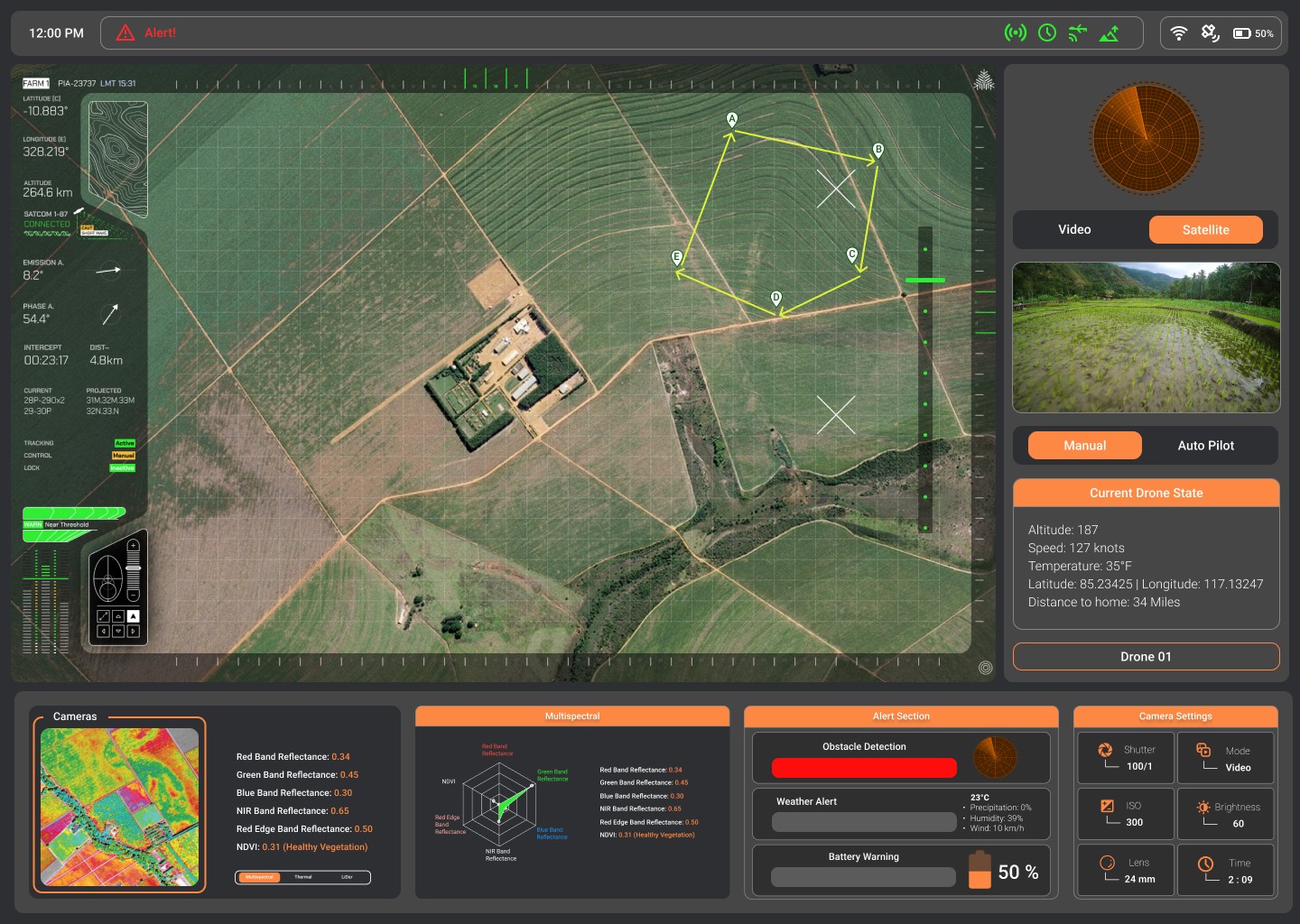
Crop Vision common operating picture: satellite map with the route, drone state, live camera, multispectral analysis, alerts and camera settings
1
Satellite map and route
Real-time satellite view with the flight path, waypoints A to E and field boundaries.
2
UAV status panel
Altitude, speed, temperature, position and distance to home, in one block.
3
Live feeds and mode
Switch between video and satellite, and between manual and autopilot.
4
Multispectral analysis
Band reflectances and NDVI, charted, for crop health.
5
Alert section
Obstacle, weather and battery alerts, colour-coded.

14 · Process

Eight steps in one semester. In the order the final deck tells them.

Eight steps in one semester. In the order the final deck tells them.

Eight steps in one semester. In the order the final deck tells them.

Five people, one semester, one final presentation. Research and blocking came first, then screens and controllers, then the body, the shift and the alerts.

Fall 2024 · HSE 542
Final presentation
1
Concept
VTOL UAV, 7 functions
2
Roles
3 roles, information needs
3
Blocking
Whiteboard, every screen
4
Screens
4 screens
5
Controllers
3 annotated units
6
Ergonomics
5th to 95th, the chair
7
Schedule
12-hour shift
8
Alerts and COP
2 levels, 1 shared picture
ToolsFigmaFigJamMiroAdobe IllustratorAdobe PhotoshopGoogle DocsWhiteboard sketching

01

Concept. A VTOL UAV with seven jobs.

02

Roles. Three roles and their information needs.

03

Blocking. Every screen on the whiteboard.

04

Screens. Four screens in Figma.

05

Controllers. Three annotated control units.

06

Ergonomics. Percentiles, the chair and the workspace.

07

Schedule. The twelve-hour work rest plan.

08

Alerts and COP. Two alert levels and one shared picture.

Tools: Figma, FigJam, Miro, Adobe Illustrator, Adobe Photoshop, Google Docs and whiteboard sketching.

15 · Outcomes

What it produced, and what it never got.

What it produced, and what it never got.

What it produced, and what it never got.

This was coursework, so there is no adoption or performance number to report. This section counts what the project made and says what it did not do.

0 → 0
roles, screens
PNPOPO
Figma screens; the payload operator gets two
Designed
0
controllers
Handheld, pilot
Case, navigator
Dual-screen case
Annotated controller boards
Designed
0
display principles applied
Designing for People, table 8.2, plus 7 control layout principles
Traceable
0 + 0
alert levels, sounds
Yellow warnings, red alerts; 3 auditory patterns
Designed
0/720
minutes of work per shift
Work rest schedule; about 1,279 kcal estimated
Calculated
0
operators tested
Never built, never deployed, never flown by an operator.
Coursework, presented in class
Not tested

3 roles, 4 screens

Figma screens; the payload operator gets two. Designed.

3 controllers

Annotated control units, one per role. Designed.

15 display principles

From Designing for People, table 8.2, plus 7 control layout principles. Traceable.

2 alert levels, 3 sounds

Yellow warnings and red alerts on every station. Designed.

600 of 720 minutes

Work in a twelve-hour shift, about 1,279 kcal estimated. Calculated.

0 operators tested

Never built, never deployed, never flown by an operator.

Not tested

No operator ever used it

Everything rests on anthropometric tables, published display principles and task analysis rather than on watching someone fly a survey.

Sample data

The percentiles use sample values

The eye height and grip calculations use the sample means and deviations in the deck, not measurements of real operators.

Shared work

Team credit

Five people shared the research, the screens and the analysis. This page does not split out individual authorship.

16 · Reflection

Hardware keeps the constraint honest. What I would defend, and what I would do next.

Hardware keeps the constraint honest. What I would defend, and what I would do next.

Hardware keeps the constraint honest. What I would defend, and what I would do next.

On screen you can move a panel and call the problem solved. A chair either fits the operator or it does not, and that kept our decisions honest.

Would defend

Three screens, not one configurable one

Filtering is cheaper, and it is what most ground control software does. It also leaves unused controls on the glass to look past while deciding.

Next time

Watch a body under pressure

Anthropometric data tells you what fits, not what gets reached for under pressure. That is the gap I would close first, with operators in a mock station.

What I kept

Design for the range, not the mean. I now start a layout by asking who sits at the edges: the shortest reach, the smallest screen, the tenth hour of a shift.

Design for the range, not the mean. I now start a layout by asking who sits at the edges: the shortest reach, the smallest screen, the tenth hour of a shift.